MisleadingCharts
Back to the gallery

The 4.6-point tax hike that looked like a cliff

A top tax rate rising from 35% to 39.6%, drawn so the taller bar stands nearly six times the shorter one.

Fox News, 2012Added July 3, 2026
Bar chart titled “Top Tax Rate” with a y-axis starting at 34%, so the 39.6% bar towers over the 35% bar
Exhibit A — as published
The same two rates on a zero-based axis, where the bars are nearly the same height and the gap is labelled 4.6 points
Exhibit B — the honest redraw

The claim

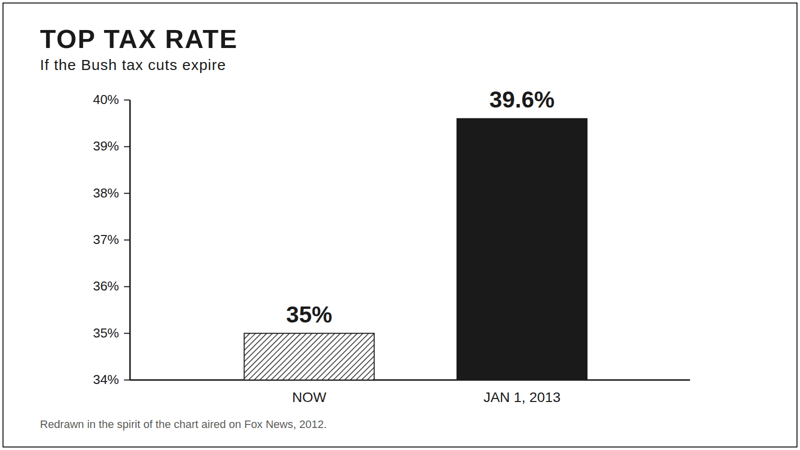
Letting the Bush tax cuts lapse would rocket the top tax rate to a punishing new high.

The trick

The y-axis starts at 34%, so a 4.6-point rise from 35% to 39.6% fills almost the whole chart — the taller bar stands roughly 5.6× the shorter one, though the rate itself climbs by about an eighth.

The honest version

On a zero-based axis the two bars are nearly the same height. The honest gap is 4.6 percentage points — a relative rise of about 13%, not the fivefold jump the ink implies.