All techniques
Axis crimes
The aspect ratio
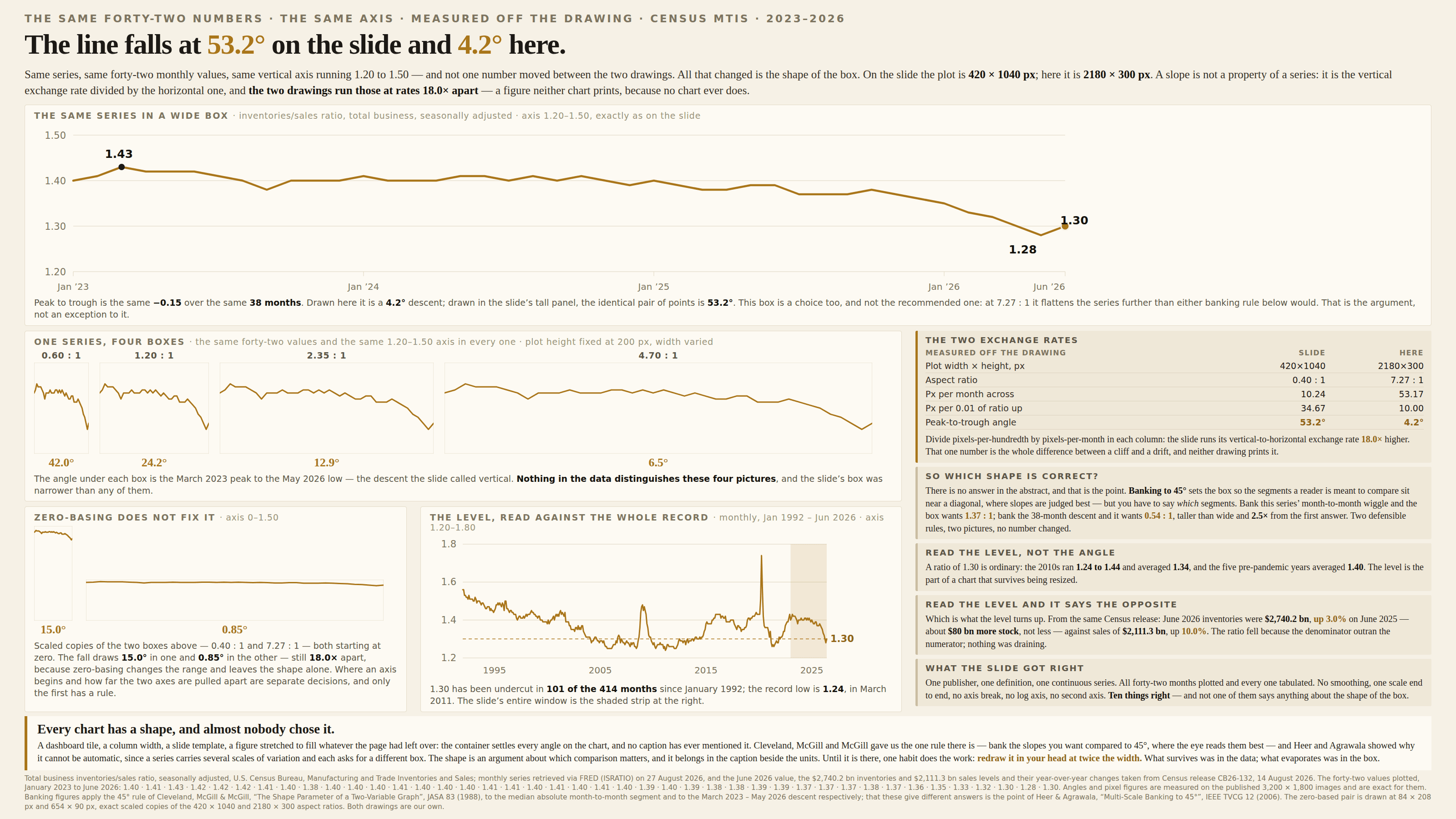
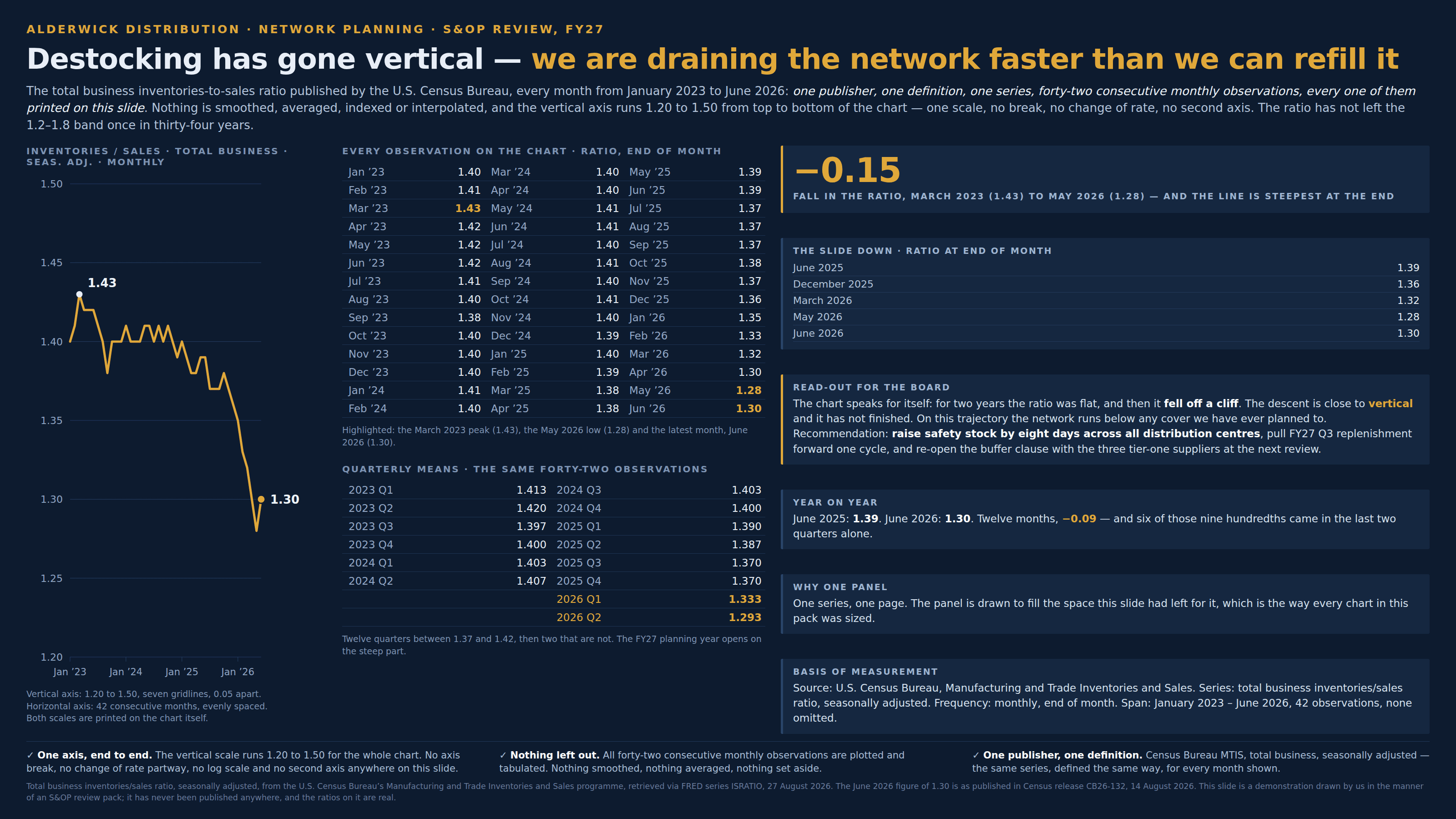
Same numbers, same axis, same range — and the slope is whatever shape the box is.
a.k.a. banking to 45° · the plot box · chart aspect · aspect ratio distortion · the squashed chart · the stretched panel · the tall chart · panel proportions
Every angle on a chart is two exchange rates divided by one another: how many pixels the vertical axis gives a unit of data, over how many the horizontal axis gives a step of time. The labels declare the two ranges and never the shape of the box those ranges are drawn in, so one series, on one scale, over one span, can be squeezed into a tall panel and read as a collapse or stretched into a wide one and read as a drift, with no number moved and no baseline chopped. It is the axis crime that survives a zero baseline, because it is not about where the axis starts but about how far apart the two axes have been pulled — and it is almost never a decision. A dashboard tile, a column width, a slide template, a figure resized to fill the space left over: the container picks the drama, and the caption never mentions that it did.
How to spot it
- A claim that is really about an angle — “vertical”, “off a cliff”, “hockey stick”, “flatlining”, “rolling over”. Angles are set by the plot box, so a claim about one is partly a claim about the layout.
- Measure the two exchange rates. How many pixels tall is one unit on the y-axis, and how many pixels wide is one step on the x? Their ratio is the entire slope, and no chart prints either number.
- Redraw it in your head at twice the width. If the finding survives, it was in the data; if it evaporates, it was in the box.
- A tall, narrow panel — a phone screen, a slide sidebar, a dashboard tile, one column of a two-column layout. Steepness is what a narrow container does to any series you pour into it.
- The same series appearing twice in one deck at two different sizes. If the two pictures tell different stories, at most one of them is about the data.
- Sparklines, tile grids and thumbnails, which have no axis at all — so the shape is the only thing being read, and the box is the only thing setting it.
- Ask whether anything on the page names the aspect ratio. Nothing ever does, the way charts once never named their units.
The fix
Choose the shape on purpose and then say what you chose. The oldest rule is still the best starting point: banking to 45°, from Cleveland, McGill and McGill’s 1988 paper on the shape parameter of a two-variable graph, which sets the box so that the segments the reader is meant to compare average out around a diagonal, because slopes are judged most accurately near 45° and get harder to tell apart as they flatten toward 0° or steepen toward 90°. Banking has a catch worth knowing, and it is the useful part: you must say which comparison you are banking. Bank the month-to-month wiggle of a noisy series and you get one box; bank the multi-year trend running through it and you get quite another, often two or three times different in shape. That is what Heer and Agrawala set out in 2006 as multi-scale banking — a series carries several scales of variation at once, and each one asks for a different box — which is not a flaw in the rule but the clearest possible demonstration that no single aspect ratio is correct in the abstract. So pick the comparison the chart is for, bank that, and print the ratio in the caption the way you print units on an axis. Then take the weight off the angle: annotate the levels, put the first and last values on the chart, and write the headline about the amount rather than the steepness, since the amount is the part that survives being resized. Where the same series appears more than once — a deck, a report, a dashboard — hold the box fixed across all of them, for the same reason a small multiple holds its axis fixed. And where the container is genuinely out of your hands, say so and give the reader the numbers, because a chart whose shape is set by a CSS grid is a chart whose slope belongs to the CSS grid.
In the gallery