All techniques
Axis crimes
The auto-ranged axis
Both ends fitted to whatever is on screen, so every window is equally dramatic.
a.k.a. autoscale · auto-range · scale to fit · fit to data · the self-fitting axis · the dynamic axis · the rolling window scale · the default axis · no ylim
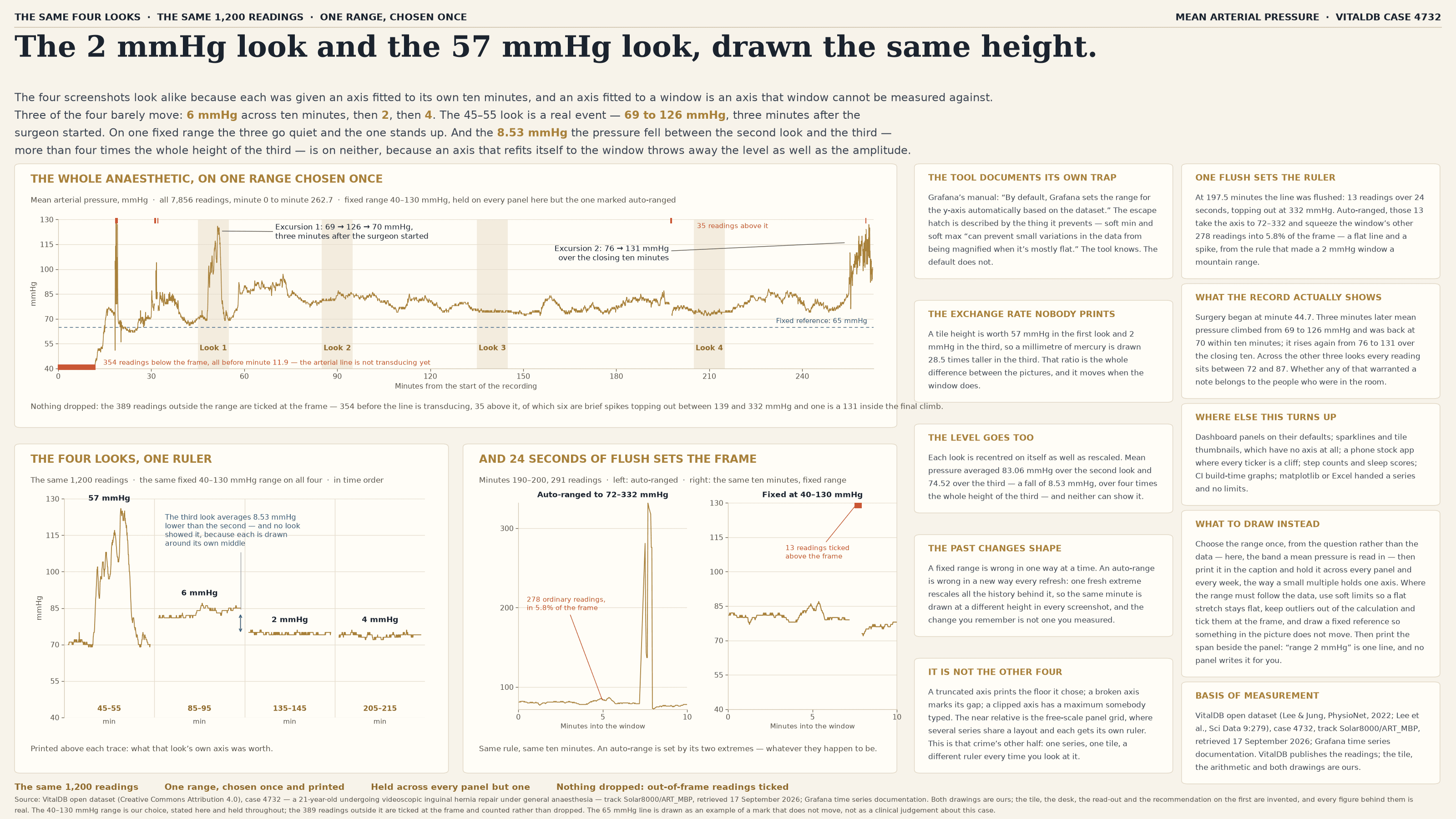
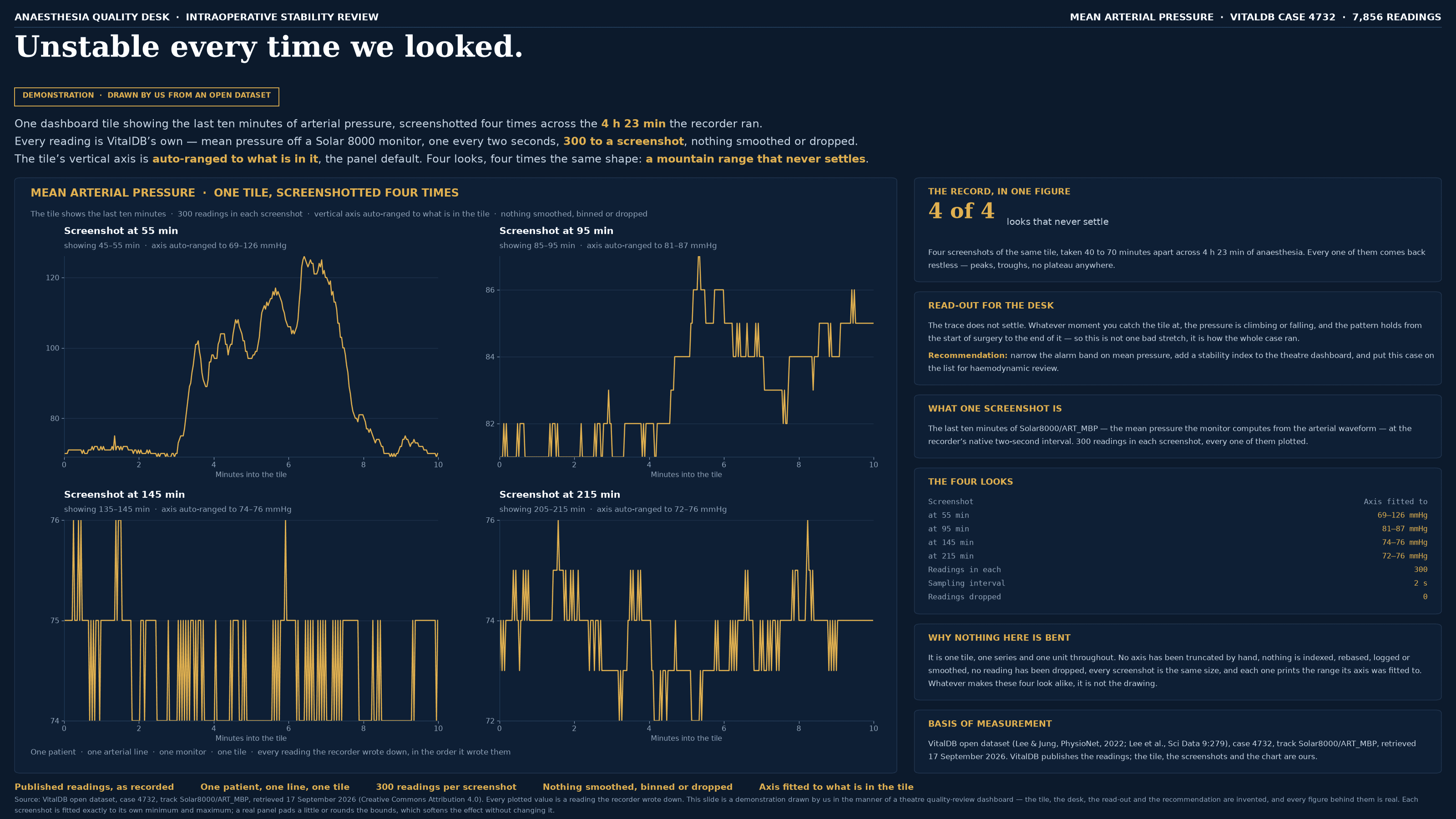
The other axis crimes are decisions. Somebody chose a floor, typed a maximum, cut a slice out of the middle; a reader who looks can see what was done and, in the first two cases, roughly undo it. This one is what happens when nobody chooses. Both ends of the scale are computed from the data currently in view, so the series fills the frame by construction and the amplitude on the page stops carrying information: a two-unit wobble and a fifty-unit collapse arrive at very nearly the same height, and the quieter the data the harder the axis zooms until the last digit of the instrument is a mountain range. The near relative is the free-scale panel grid, and the two are worth telling apart, because they are one rule applied along two different directions: there, several series sit side by side and each panel is given a ruler of its own, so at least the grid is visible and a reader who checks the axes can catch it. Here it runs along time instead. One series, one panel, one place on the dashboard — and a different ruler every time anybody looks at it, with nothing on screen to compare against. Three consequences follow, and none of them is visible in the picture. The exchange rate between a unit of data and a millimetre of screen is recomputed every time the window moves, so two pictures of one series are not comparable and the change you remember seeing is not one you measured. The scale is recentred as well as resized, so a level difference between two panels — often the actual finding — appears on neither of them. And both ends are set by the two most extreme points in view, so a single spike, a sensor glitch or one flush of a line decides how everything else in the window is drawn.
How to spot it
- A series that fills its frame top to bottom with little or no headroom. Real measurements do not land on the edges of a plot; an axis fitted to them does, every time. Most tools pad the fit slightly or round the bounds outward, so the trace stops just short of the frame rather than touching it — the effect is the same, and the near-miss is the tell.
- Read the axis numbers before you read the shape, and ask what the whole height of the panel is worth. If the answer is two units, then the mountain range is two units tall, and the drama is the frame.
- Flat data drawn as noise. A quiet stretch is exactly when an auto-range has the least to work with, so it magnifies whatever is left — which is usually the rounding of the instrument.
- One spike and a flat line along the bottom. Same rule, other direction: the extremes set both ends, so a single glitch takes the entire scale with it and squeezes the real data into a few per cent of the frame.
- A panel with no axis numbers at all — a sparkline, a dashboard tile, a thumbnail, a phone widget, a cell in a spreadsheet. There the fitted range is invisible as well as unstated, and the shape is the only thing being read.
- The same series in two places that do not look the same. Put today’s dashboard beside last week’s screenshot of it: if the silhouette changed and the underlying numbers did not, the axis moved.
- A comparison drawn across panels. Each is centred on its own middle, so a step between two windows is not small on the chart, it is absent from it.
- In code and configuration it is usually the absence of a setting rather than the presence of one: no ylim in matplotlib, Grafana’s axis min and max left on Auto, an Excel chart with Auto still ticked, a charting library handed a series and no bounds. Grafana documents the failure inside the description of the cure — soft min and soft max “can prevent small variations in the data from being magnified when it’s mostly flat”.
The fix
Choose the range once, from the question rather than from the data, and then say what you chose. The test is whether you could name the bounds before seeing the series: a blood pressure is read in a band a clinician can state, a latency budget has a target, a percentage has a hundred. Write that range into the caption the way you print a unit, and hold it — across every panel in a grid, across every width of window, across every week the dashboard is looked at — for the same reason a small multiple holds one axis: the whole value of the comparison is that the ruler did not move. Where the range genuinely has to follow the data, and often it does, make it follow slowly and visibly. Use soft limits, which widen for real excursions but will not zoom into a flat stretch. Compute the bounds from a robust range rather than the minimum and maximum, so one glitch cannot set the scale, and tick the excluded points at the frame with a count rather than dropping them. Put something in the plot that does not move — a target line, a normal band, a reference series — so the reader has a fixed thing to measure the wiggle against. Then print the span as a number beside the panel: “range 2 mmHg”, “range 4 ms”, “this window spans 0.3%”. It is one line, it survives being screenshotted, and it is the one line no panel will ever write for you. Above all, resist the reflex to read a shape off a picture whose scale you have not checked. On an auto-ranged axis the shape is the one thing guaranteed to be there whatever the data does, so it is the one thing that cannot be evidence.
In the gallery