All techniques
Axis crimes
The broken axis
The zero is still there. The middle is missing.
a.k.a. axis break · scale break · the squiggle · the zigzag · discontinuous axis · the gap in the scale
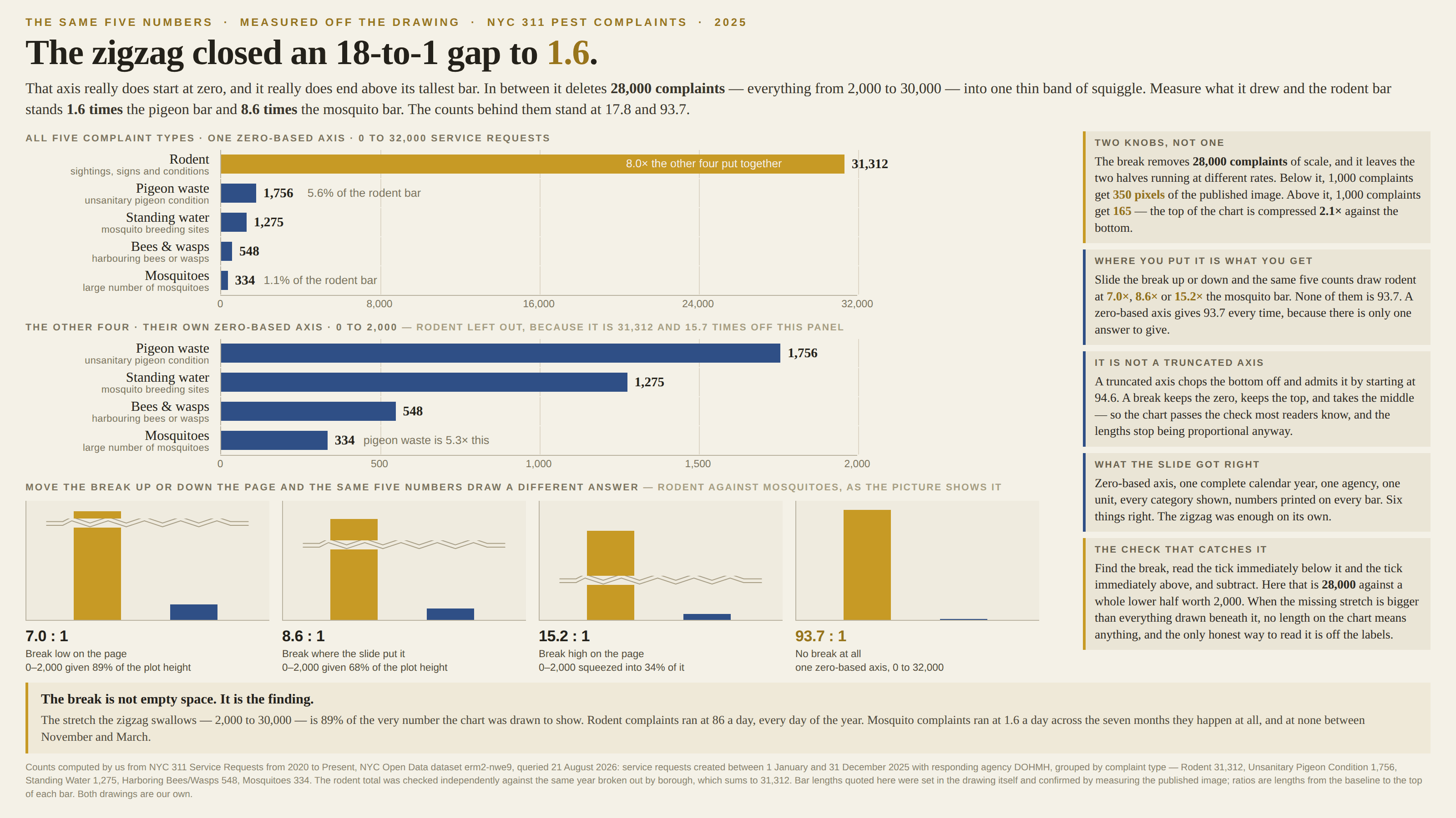
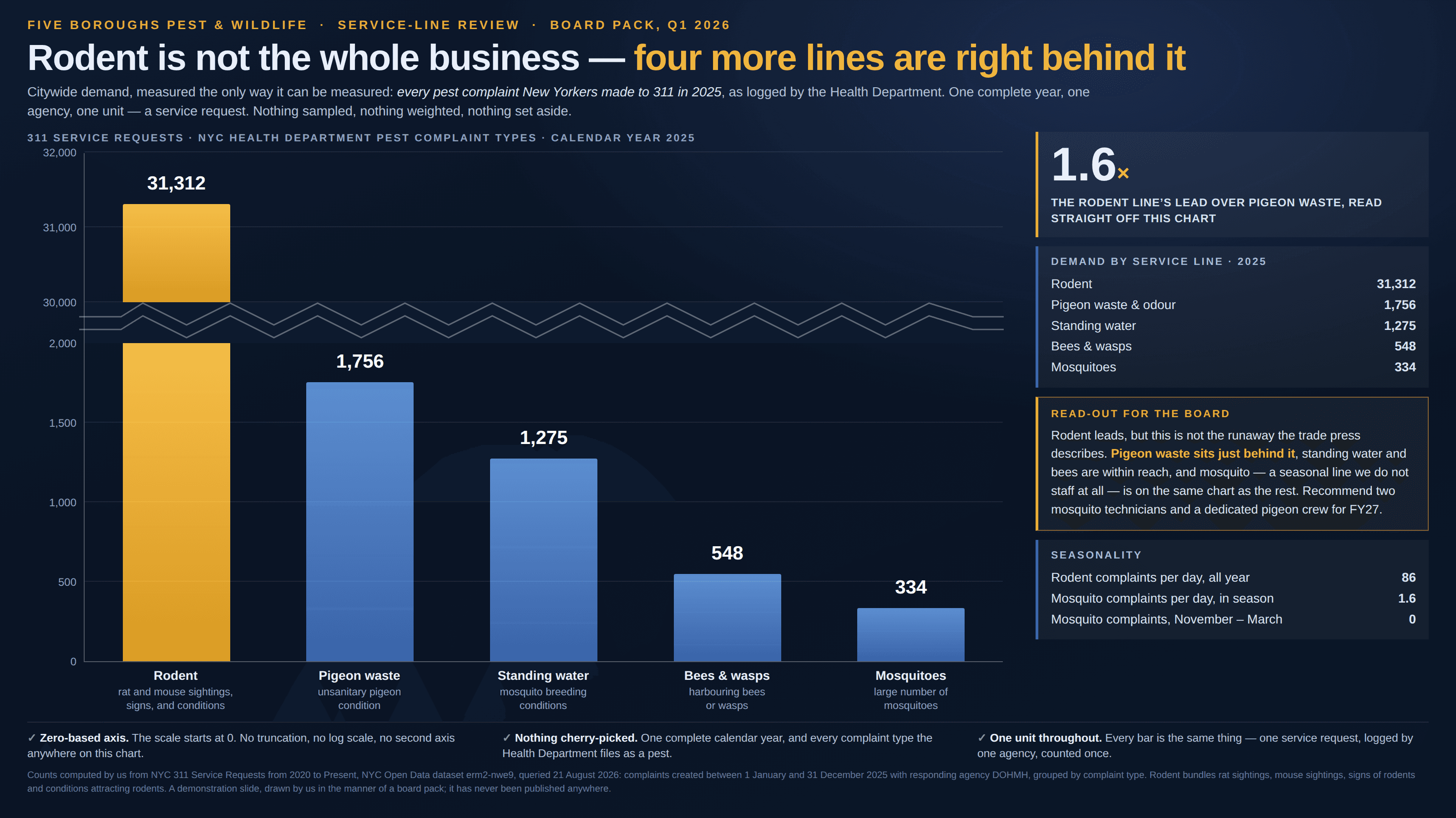
A truncated axis chops the bottom off the scale and announces itself by starting at 94.6. A break does something quieter: it keeps the zero, keeps the top, and takes a slice out of the middle, marking the theft with a small zigzag most readers have been trained to read as a tidying-up. What it removes is not empty space — it is the part of the scale where the difference between the bars actually lives, so lengths on either side of it stop meaning the same thing and the ratio between any two bars becomes whatever the designer’s choice of gap made it. Worse, the two halves are almost never drawn at the same rate: the compressed top buys room for the giant, and every unit up there is worth a fraction of a unit down below.
How to spot it
- Look for the break itself — a zigzag, a pair of parallel slashes, or a plain white band running across the plot and through the axis.
- Read the tick immediately below the break and the tick immediately above it, then subtract. That number is what the chart deleted.
- Compare the deleted stretch against the whole span drawn below it. If more scale is missing than is shown, no length on the chart is proportional to anything.
- Measure the rate on each side: count the pixels between two gridlines below the break, then between two gridlines above. They are rarely the same.
- A break appearing at all means one bar did not fit. Ask how much it did not fit by — that is the finding the break was inserted to hide.
- Broken axes hide in the places where a zero-based axis is a rule: bars, columns, waterfalls. On a line or a dot plot the same gap is a smaller crime, because those marks encode position rather than length.
The fix
A bar’s length is its whole claim, so a bar chart cannot have a break in it — if one value dwarfs the rest, the dwarfing is the story, and the honest chart is the one where four bars are nearly invisible next to a fifth. Where the small values also deserve to be read, give them a second panel at their own zero-based scale, sitting beside the first, with a line saying how far off the panel the big one is: two axes plainly labelled beat one axis quietly interrupted, because the reader can see exactly where the comparison stops. A log axis is the other honest answer for a range that genuinely spans orders of magnitude, provided it is labelled loudly and drawn with dots rather than bars. And if the break is unavoidable — a single outlier in a small-multiple grid, say — print every value on the chart and say in the caption what the gap swallowed, since a number the reader has to take off the labels was never really plotted.
In the gallery