All techniques
Cherry-picking
The immature cohort
Every bar is a whole year. Only the old ones have had time to finish.
a.k.a. right-censoring · incomplete follow-up · cohort maturity · seasoning · vintage curves · loss development · the lag triangle · unequal exposure time · immature vintages · the unfinished bar
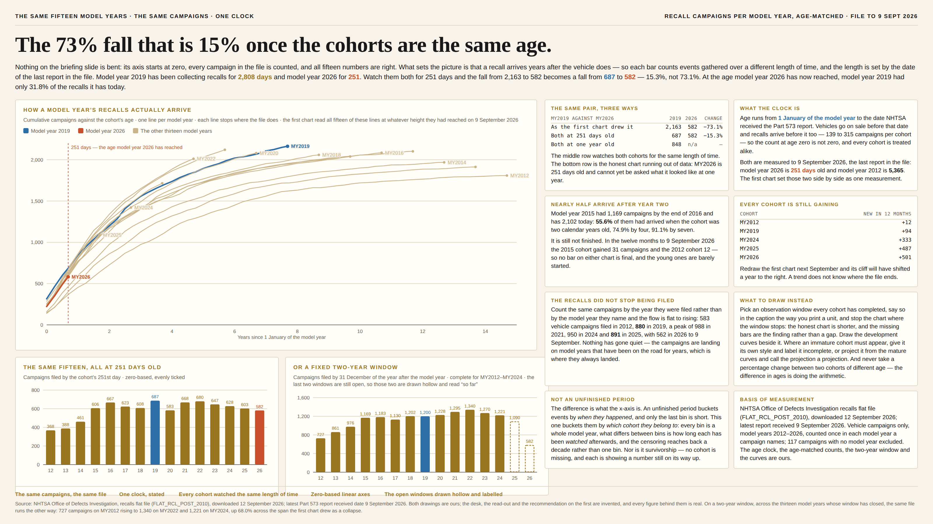
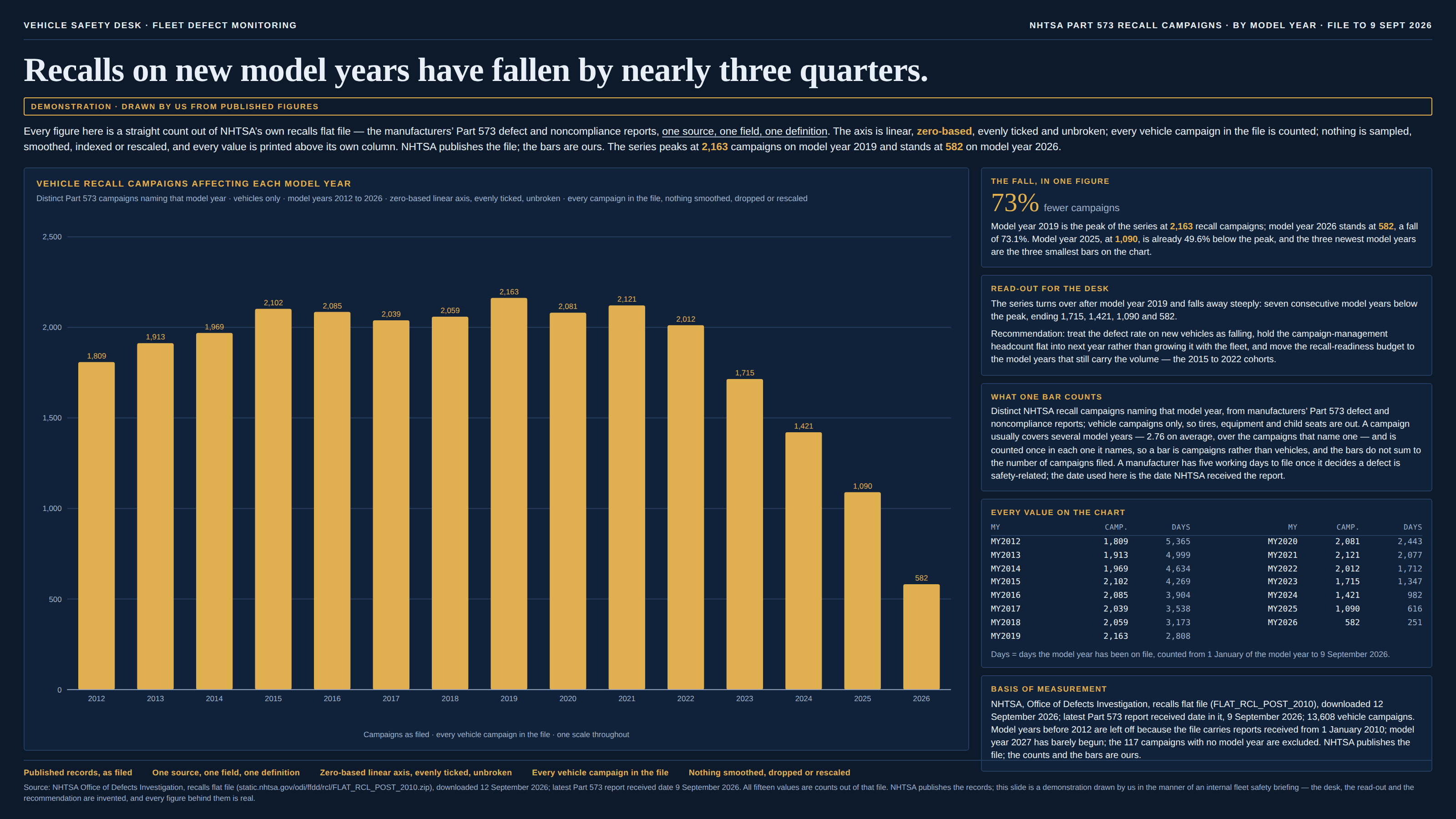
Some events do not arrive with the thing they belong to. A recall attaches to a model year built years earlier, a citation to a paper published a decade ago, a claim to the policy year it happened in, a default to the quarter the loan was written, a complaint to the product that shipped last spring. Group those events by the cohort they belong to and the chart looks like a trend, but it is not one measurement repeated: each bar is a count of everything that has arrived so far, and how long “so far” has been running is set by the date somebody pulled the data. The oldest cohort has been collecting for a decade and the newest for a few months, so the x-axis is doing two jobs at once — it is a category axis, and it is a clock running backwards. The damage is always the same shape and always in the same direction. The right-hand end of the chart falls away, the fall gets steeper towards the edge, and the shortfall reads as good news where the events are bad ones: fewer defects, fewer claims, fewer defaults, a safer product, a quieter year. Nothing has been excluded and no axis is bent. The newest bars are simply unfinished, and a bar has no way of saying so.
How to spot it
- Ask how long each bar has been watched. Subtract the cohort’s start from the date the data was pulled; if that number changes along the x-axis, the x-axis is also a clock, and no two bars are the same measurement.
- A decline that begins near the right-hand edge and steepens towards it. That is the shape of a censoring curve rather than of a trend — a real change in the world does not know where the file ends.
- Ask whether the event can arrive late, and how late. Recalls, citations, claims, defaults, revisions, refunds, reviews, diagnoses, prosecutions and repairs all attach to a cohort long after the cohort closes, and the lag is usually measured in years.
- Check the oldest cohort. If it is still gaining events, then no bar on the chart is final — and the young ones are barely started.
- Count the same events by the date they happened instead of by the cohort they belong to. If that flow is flat while the per-cohort chart collapses, the collapse is the clock.
- Redraw it next month. Any chart whose past values grow when you re-run it is censored; the only question left is by how much, and the newest bars carry nearly all of it.
- Rates do not save you. Per thousand vehicles, per paper, per policy — the denominator is fixed early and the numerator goes on arriving for years, so a rate censors about as hard as a count does.
- The vocabulary is a warning in itself: seasoning, maturity, vintage curves, loss development, lag triangles, right-censoring, time-to-event. Credit risk, insurance and epidemiology all named this, because all three have been bitten by it.
The fix
Give every cohort the same clock. Pick an observation window that all of them have completed — twelve months from the start of the model year, two calendar years, five years from publication — count only the events that arrived inside it, and say in the caption what the window is, the way you print a unit. The honest chart then stops earlier than the data appears to allow, and that is the feature rather than the cost: the missing bars are the finding, because the alternative is a bar that says “fewer” when it means “not yet”. Draw the development curves beside it, one line per cohort, cumulative against age, each stopping where the file does. It is the single most useful picture in this whole family — it shows the lag, shows how far each cohort has got, and makes the age-matched comparison something the reader can see rather than take on trust. Where an immature cohort has to appear, give it its own style and label it incomplete, or project it from the mature curves and call the projection a projection: actuaries have done this for a century with development factors, and a dashed bar with a stated method beats a solid one that is quietly wrong. Print the as-of date on the chart, since every number on it is “as at” something. And never take a percentage change between two cohorts of different age — not in a headline, not in a read-out, not in a footnote — because the difference in their ages is doing the arithmetic. Two neighbours are worth keeping it apart from, and the first of them is close enough to be worth a sentence. The unfinished period buckets events by when they happened, so only the last bin is short and the fix is to drop or mark that bin; this page buckets them by which cohort they belong to, so every bin is calendar-complete, the shortfall reaches back a decade rather than one bin, and no amount of waiting for the current period to end will settle it. Where a reporting lag is the whole story and the buckets are dates, that is the other page. And survivorship is about cases that left the dataset, where here nothing is missing at all: every cohort is present, and the young ones are showing a number that is still on its way up.
In the gallery