All techniques
Cherry-picking
The twentieth test
Run enough comparisons on nothing and one of them will come out significant.
a.k.a. multiple comparisons · multiple testing · the multiplicity problem · look-elsewhere effect · fishing expedition · data dredging · p-hacking across outcomes · subgroup fishing · the jelly bean problem · family-wise error · reporting only the significant metrics
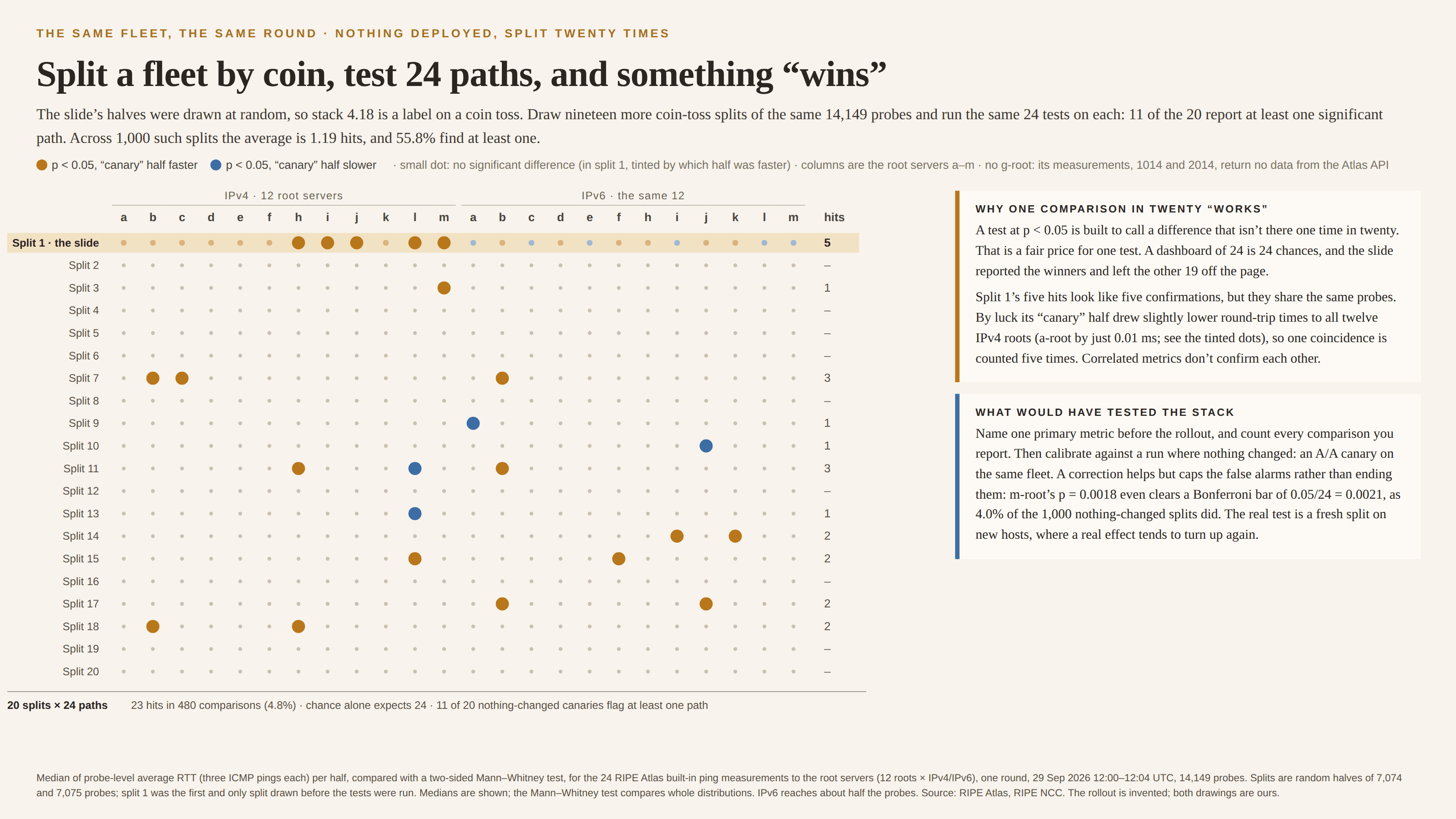
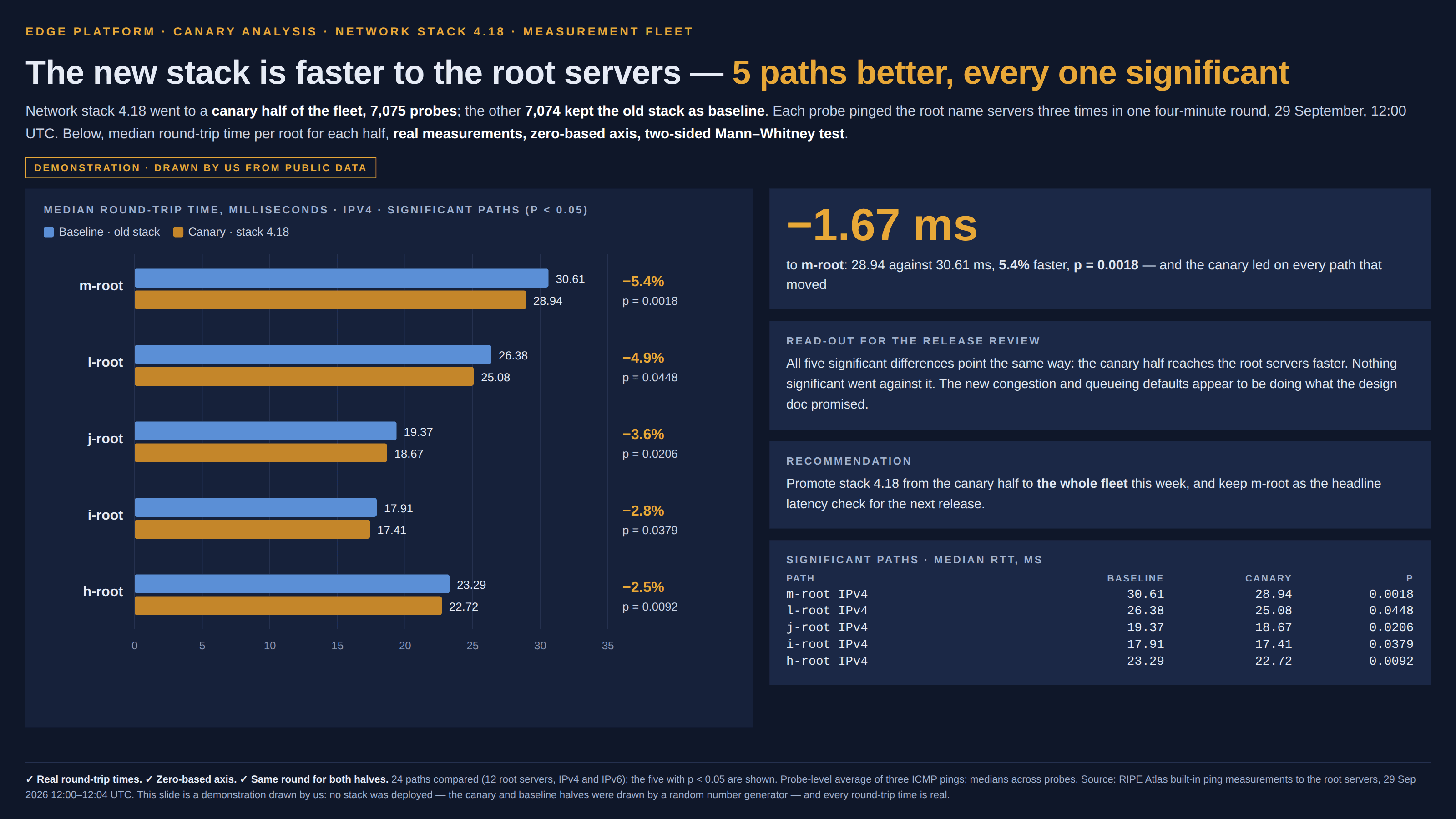
A significance test is a promise about one question. Set the bar at p < 0.05 and, when there is truly nothing there, the test will still call a difference one time in twenty. That is the error rate everyone has agreed to live with, and it is a fair price for one question. Ask twenty and the price is paid twenty times. Ask twenty-four, as a dashboard of latency panels or a release review with a metric per region does without anyone deciding to, and when nothing has changed at all the expected haul is a little over one “significant” result, with better-than-even odds of at least one. Then the chart is drawn from the hits. Each bar is real, each p-value is correctly computed for the comparison it belongs to, the axis starts at zero, and the reader is never told that the bars on the page were chosen because they cleared the line out of a larger set that mostly did not. The selection happens before the chart is drawn, which is why the chart looks clean. Correlated metrics change the shape of the problem rather than its size. Metrics computed over the same hosts, patients or customers share whatever luck those units brought with them, so false alarms don’t come more often, they come in clumps: fewer analyses find anything, but the ones that do tend to find several at once, all pointing the same way. Five hits that agree look like five confirmations. They can be one coincidence counted five times. The page has two close cousins in this group, and the difference is what gets multiplied. The early stop takes many looks at one comparison as the sample grows. The file drawer runs many whole studies and publishes the ones that worked. This one runs many comparisons inside a single study, often all at once on the same data, and shows the ones that crossed. All three are the same arithmetic: the more chances a result has to cross the line, the less crossing it means.
How to spot it
- Count the comparisons, not the bars. A chart of five significant metrics from a dashboard of forty is a different finding from a chart of the five metrics somebody named before the test.
- Look for the phrase “significant metrics”, “paths that moved” or “where we saw an effect” in a title. It means the rows were picked by their p-values.
- Ask what the expected number of false hits was. Multiply the number of tests by the threshold: 24 tests at 0.05 expect 1.2 hits when nothing is there. A report with one or two hits may be reporting exactly that.
- Be wary of p-values sitting just under 0.05. A haul of 0.04s and 0.03s is what chance throws up when it is given enough tries.
- Check whether the hits share units. Metrics measured on the same hosts, patients or stores are not independent witnesses, and agreement among them is weak evidence.
- Look for subgroups. “No overall effect, but a strong one in left-handed users over 50” is the same thing with the comparisons hidden in the slicing.
- Ask whether anyone ran the same analysis where nothing changed. An A/A test, a placebo date or a shuffled label shows what the pipeline finds when there is nothing to find.
The fix
Decide before the data arrives which comparison the result rests on, write it down, and report it first, whatever it says. Everything else is exploration and should be labelled as such. When many comparisons do matter, report them all, the misses alongside the hits, and say how many there were, so the reader can do the multiplication that the chart hides. Correct for the count: Bonferroni divides the threshold by the number of tests, Holm does the same a step at a time and loses less power, and false-discovery-rate control (Benjamini–Hochberg) suits the dashboards and screens where some false hits are acceptable as long as you know roughly how many. Be clear about what a correction buys: it caps the chance of any false alarm across the whole family at the rate you chose, so it can still be wrong up to that often, and a hit that clears it is not proof. The strongest check is empirical. Run the same pipeline where nothing changed — an A/A test, a shuffled label, the same split drawn again — and see how many hits it produces, then judge the real run against that. And test a surprising hit on fresh units: a difference that belongs to the change tends to turn up again on new hosts or new patients, and a difference that belonged to the luck of the draw tends not to — though a winner picked for clearing the line usually overstates its size, so expect a real effect to come back smaller.
In the gallery