All techniques
Axis crimes
The padded axis
The frame is the size of the unit. The data is the size of the data.
a.k.a. the 0-to-100 axis · full-scale deflection · scaled to the unit · the spec-sheet scale · axis headroom · dead space · the flattened axis · the over-ranged axis · the empty frame
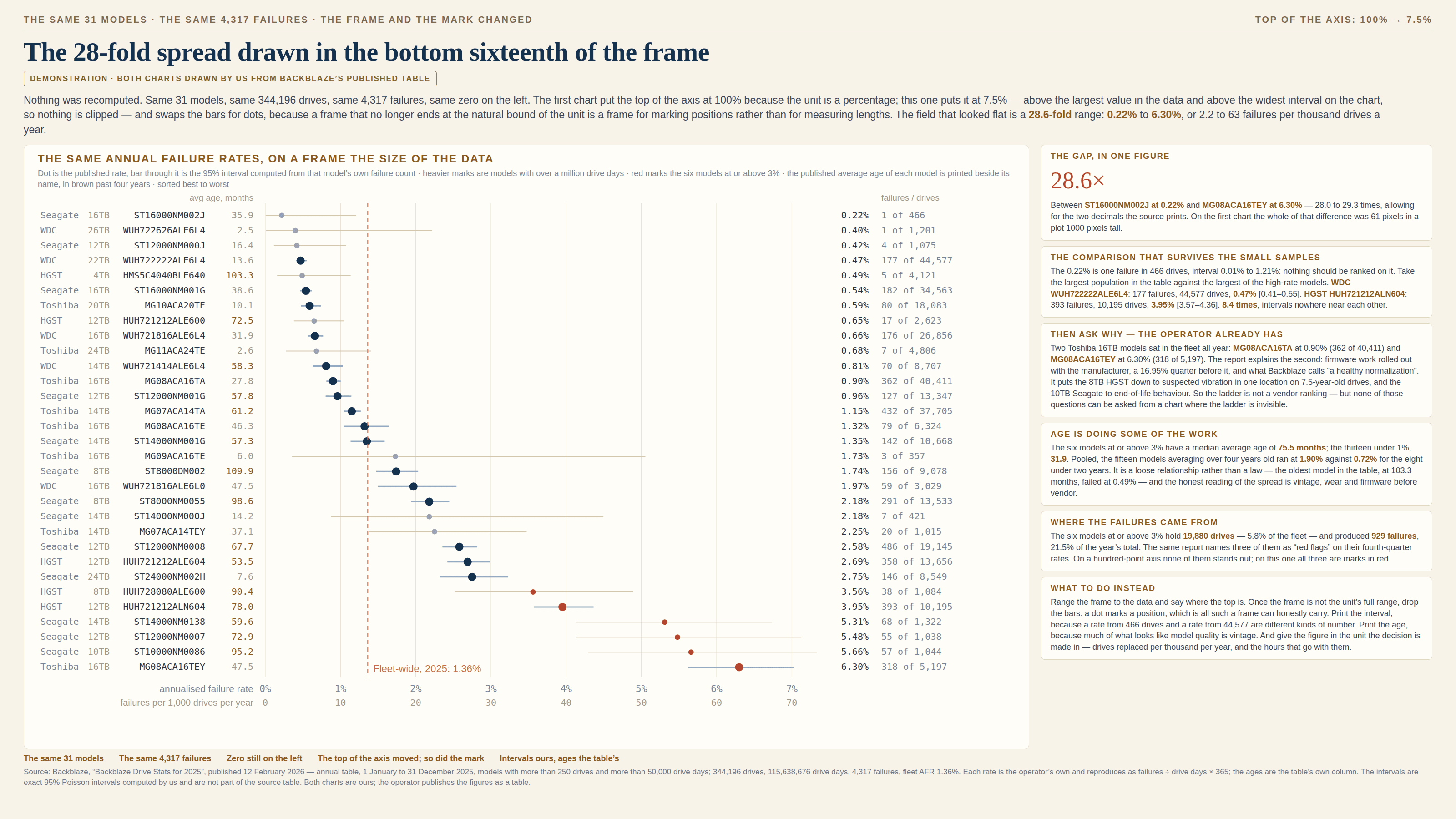
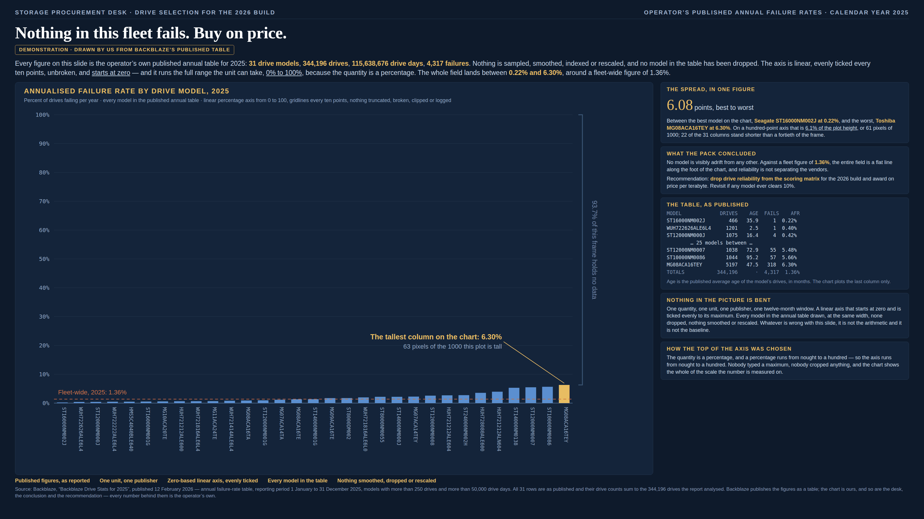
The truncated axis raises the floor and makes a small difference enormous. This one is the same decision taken at the other end of the scale, and it makes a large difference invisible: the baseline is honest, the ticks are even, nothing is broken or clipped, and the top of the axis was chosen from the unit rather than from the numbers. A percentage runs to a hundred, so the axis runs to a hundred. A score runs to ten, a rating to five, a dial to whatever the face was printed with, a meter to its full-scale deflection. The data then lands in the first few per cent of the frame, and everything above it is a wall of empty box. What makes this one slippery is that the arithmetic is untouched. Bars from zero keep their ratios exactly: a model that fails twenty-eight times as often really is drawn twenty-eight times as tall, and anybody who measures the ink with a ruler gets the right answer. But nobody measures the ink. The eye reads each mark against the frame and against its neighbours, and when the whole field is a row of stubs along the floor, a twenty-eight-fold range arrives as a handful of pixels — below the size at which two lengths can be told apart by looking at them, which is where comparison actually happens. The conclusion the picture delivers is that nothing here is adrift, the variation is noise, the choice does not matter; and that conclusion was written by the empty space rather than by the data. It is most at home wherever the interesting quantity is rare — failure rates, fraud rates, defect rates, error rates, anything counted in parts per something — because rare things live near the bottom of their unit by definition, and the tool that drew the chart has no way of knowing that the bottom is where the whole story is. Four neighbours are worth telling it apart from, and the closest in outcome is the bar with no true zero, which produces the same wall of identical bars and takes the same cure — a dot plot and a unit people act in. The difference is where the damage is. There a constant sits inside every bar, so the ratios between them are wrong and subtracting the origin fixes it; here the ratios are exactly right and merely too small to see, so nothing needs recomputing and only the frame moves. The other three are about the frame as well. The clipped axis puts the ceiling below the data and flattens what pokes through; this one puts the ceiling far above it and flattens everything. The auto-ranged axis takes both ends from the data every time it is drawn, so every window is equally dramatic; this is the same abdication running the other way, and between the two of them sits the honest thing nobody did, which is to choose the bounds once, from the question. And the truncated axis is its mirror: raising the floor manufactures drama, padding the ceiling erases it, which is why the padded axis tends to turn up in charts that want a reassuring answer rather than an alarming one.
How to spot it
- Read the axis maximum first and ask where the number came from. If it is a property of the unit — 100%, 1.0, 10, five stars, the top of the dial — rather than a number anything in the data goes near, the frame was settled before the data was looked at.
- Measure the dead space. What share of the plot sits above the tallest mark? Past about four fifths empty, the chart is mostly frame, and whatever it is being used to claim is a claim about the frame.
- A caption that says the field is uniform, flat, or all much of a muchness, printed beside a table whose largest value is several times its smallest. A ratio the eye cannot see is still a ratio; check it in the numbers rather than in the picture.
- Rates of rare events on a percentage axis: drive failures, payment fraud, defects, cancellations, infections, adverse events. The rarer the thing, the smaller the part of the frame it can ever occupy, and the more the picture says nothing is happening.
- Fixed-range furniture that came with the tool: a 0-to-100 progress bar, a five-star average, a 0-to-10 score, a gauge inherited from an instrument panel. Nobody chose these maxima for this data; they were in the box.
- A legitimate zoom that looks like a crime. If the only way to see the data is to bring the top of the axis down, look at the mark before you object: bars in a frame that no longer starts at zero are the truncated axis, and dots in the same frame are not.
- A conversion nobody performed. Small percentages usually have a natural unit on the other side of a multiplication — per thousand, per year, per shift, drives replaced, hours of work — and its absence is a good sign the chart was drawn in the unit the tool had rather than the unit the decision is in.
The fix
Set the top of the axis from the question, not from the unit, and then say where you set it. A frame ranged to a little above the largest value in the data, with the bound printed in the caption, gives the comparison back at once and costs a reader nothing but one line of reading. The part that trips people is the rule they learned first: bars start at zero, always. That rule is about the mark, not about the frame, and it is the reason the cure here is not to raise the floor. A bar encodes a length, so it needs the zero and it needs the full range beneath it; a dot encodes a position, which is all a ranged frame can honestly carry. Change the mark and the zoom stops being a lie: a dot plot, a strip plot, a range-framed line will all sit happily in a window that runs from nought to seven per cent, and none of them is making a promise about length that the frame cannot keep. Then do the multiplication the percentage was hiding. Almost every small rate has a unit on the other side of it that people act in — failures per thousand drives a year, cancellations per hundred trains, one in every forty orders, an engineer-day a week — and printing that figure beside the chart does more for a reader than any amount of redrawing. Put the uncertainty on the marks while you are there, because a rate computed from four hundred units and one from forty thousand are different kinds of number and a ranged frame is where that difference finally becomes visible. Keep the full scale where the full scale is genuinely the subject — a battery, a quota, a share of a vote, anything whose hundred is a real destination — and where you need both, draw both: the whole unit once, and an inset at the size of the data, which is the small-multiple answer to the same problem. And do not overcorrect into the opposite failure. An axis refitted to whatever is on screen each time is the auto-ranged axis, and it destroys comparability just as thoroughly; the fix for a frame chosen without looking is a frame chosen on purpose, held still, and written down.
In the gallery