All techniques
Size & scale
The Sankey ribbon
A ribbon is a length that has been bent, and two of them are never added by eye.
a.k.a. Sankey diagram · alluvial diagram · flow diagram · the income-statement Sankey · the P&L Sankey · the where-the-money-goes chart · riverplot · d3-sankey
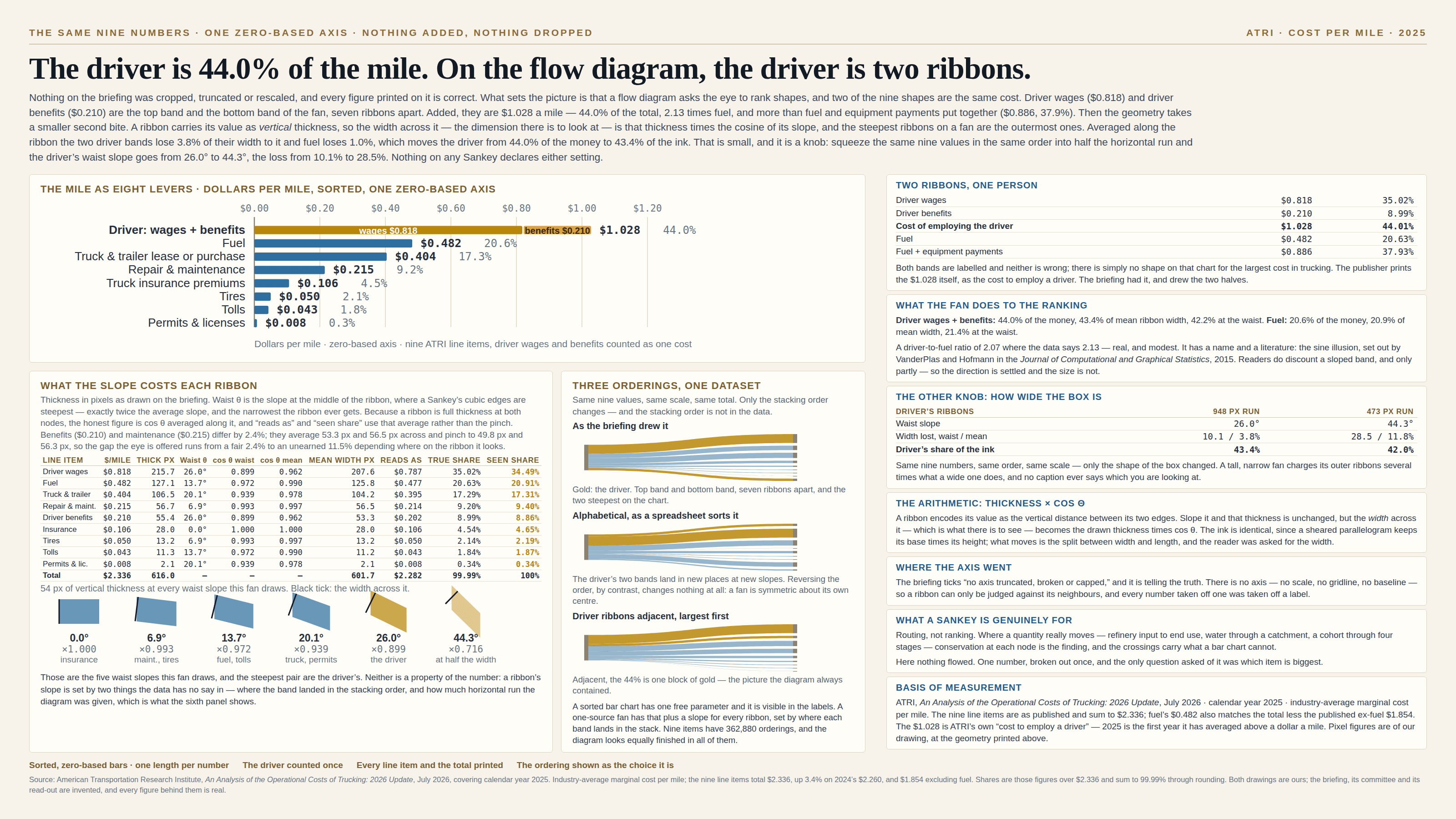
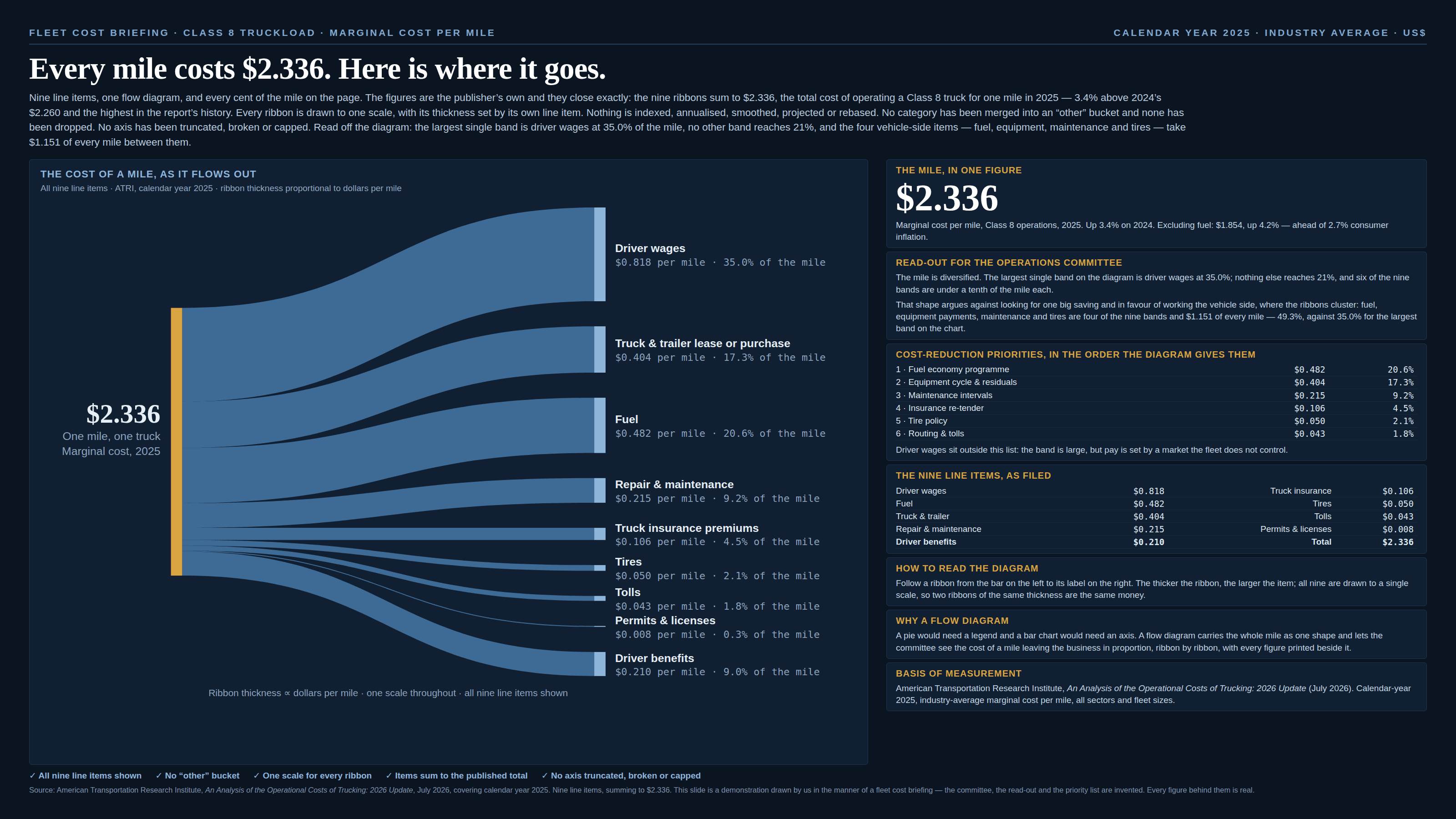
A Sankey encodes each quantity as the vertical distance between a ribbon’s two edges, and the arithmetic is usually impeccable — every ribbon to one scale, every node conserving its total. What it asks of the reader is harder than it looks, in three ways. It ranks by shape, so anything split across two ribbons is judged as two ribbons: salary beside benefits, licence beside support, each labelled, each correct, and no shape on the page for the pair. It gives every ribbon a slope, and a sloped band’s width — measured across it, which is the dimension there is to look at — is its drawn thickness times the cosine of that slope, the ink unchanged and the split between width and length quietly moved. And the slope itself is not a fact about the number: it comes from where the band landed in the stacking order and from how much horizontal run the diagram was given, which is a fact about the panel. Under all three sits the plainest thing of all. A Sankey prints no scale, draws no gridline and offers no baseline, so a ribbon can only be judged against its neighbours.
How to spot it
- Ask whether one thing has been drawn as two ribbons. Wages and benefits, hardware and shipping, licence and support: each is labelled, each is right, and nobody adds two shapes by eye — so a category drawn twice reads smaller than its total.
- Look for the scale. A Sankey carries none, which means the numbers you are reading came off labels rather than off the chart, and a ribbon you cannot find a label for is unmeasurable.
- Check the outermost ribbons, top and bottom, since a fan puts its steepest bands at its edges. On the curved links most libraries draw, the slope halfway across is exactly twice the average, and that waist is the narrowest the ribbon ever gets — so read the pinch as the worst case rather than the whole story.
- Measure the diagram’s stack against its horizontal run. Pour the same fan into a narrow column and every slope steepens: it is the aspect-ratio trick riding along, and the shape of the box is the one parameter no chart has ever printed.
- Reorder the nodes in your head. Nine categories have 362,880 orderings and the picture looks equally finished in all of them — though not every re-ordering does something, since reversing one changes no slope at all, a fan being symmetric about its centre.
- Ask what is flowing. Where a total simply fans out into its parts, nothing moves between the two columns, and the whole apparatus of nodes and crossings is drawn over what is really a list.
- On a multi-stage diagram, remember that ink is not conserved the way the quantity is: a flow crossing four stages is drawn four times, and the node that appears in every stage looks the most important by construction.
The fix
Decide which of the two questions a flow diagram gets asked you are actually answering, because it is reliably good at one of them. Where does it go is its question: a quantity that genuinely moves, conserved at every node, the crossings carrying the routing — crude oil into refined product into end use, water through a catchment, a cohort through four stages of a funnel. Which is biggest is not, because ranking wants marks on a shared baseline and a fan has no baseline to share. Asked the second question, reach for a sorted bar chart and let the ribbons go. Before you draw either, add up the things that are one thing: a cost split across two rows is one cost, and the reader should meet it as one mark with its parts inside rather than as two shapes to combine mentally. When a Sankey is right, hand it what it is missing. It has no axis, so the scale goes in the caption the way a unit goes on one, and every ribbon gets its number printed on it. It has an ordering, so choose one deliberately, say what you sorted by, hold it across every version, and put whatever ought to be read together next to itself. It has a shape, so state the proportions or keep them fixed, since the same fan in a narrow column charges its outer ribbons several times what a wide one does. And where both questions are genuinely live, the honest answer is usually both charts — the flow for the routing, a short sorted chart beside it for the ranking, and no confusion about which one the decision came off.
In the gallery