All techniques
Framing & context
The seasonal swing
The biggest move on the chart is the one that happens every year.
a.k.a. seasonality · unadjusted data · not seasonally adjusted · NSA · the sawtooth · month on month · calendar effects · trading-day effects · the holiday shutdown · seasonal adjustment · X-13ARIMA-SEATS · TRAMO-SEATS
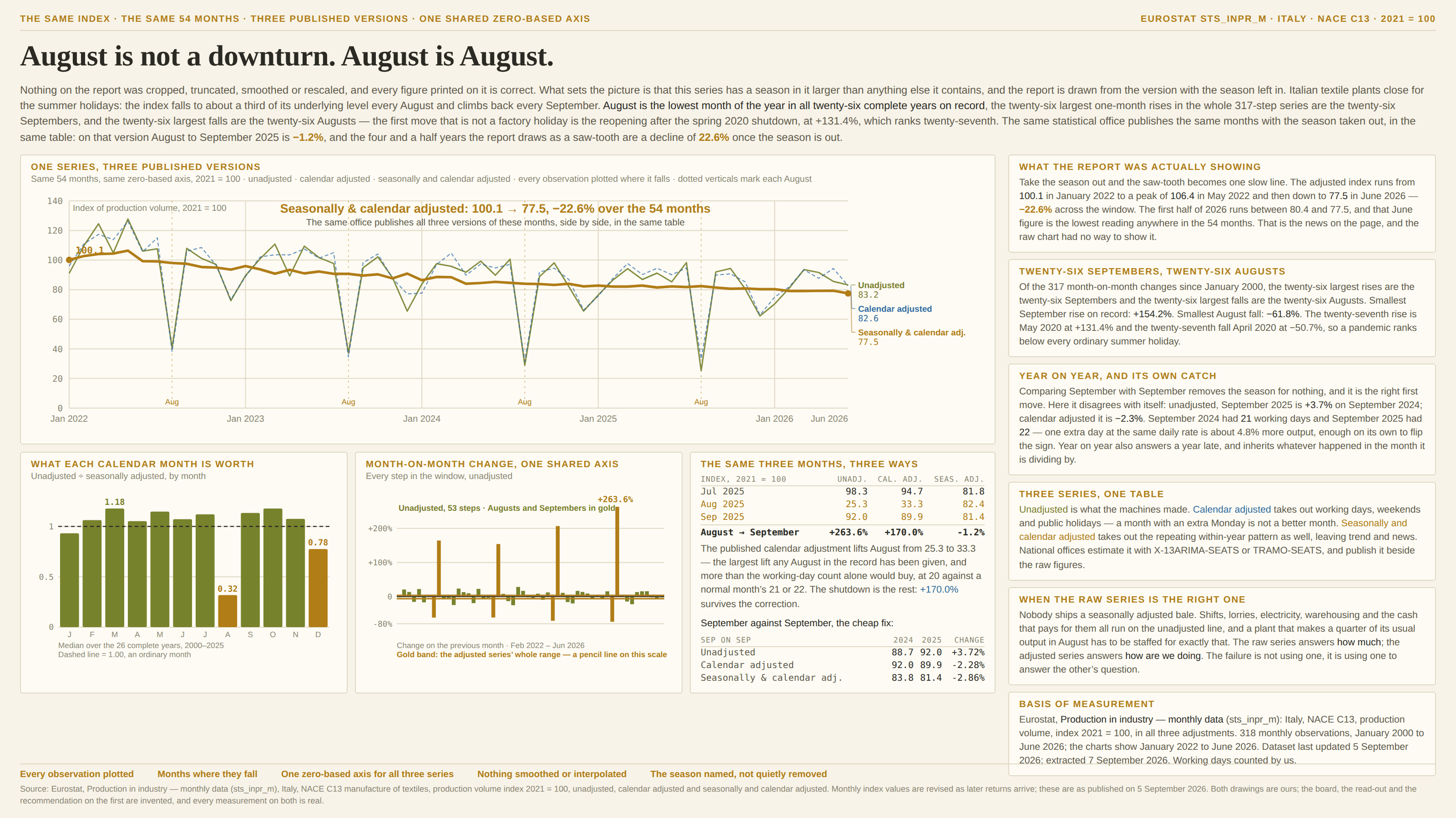
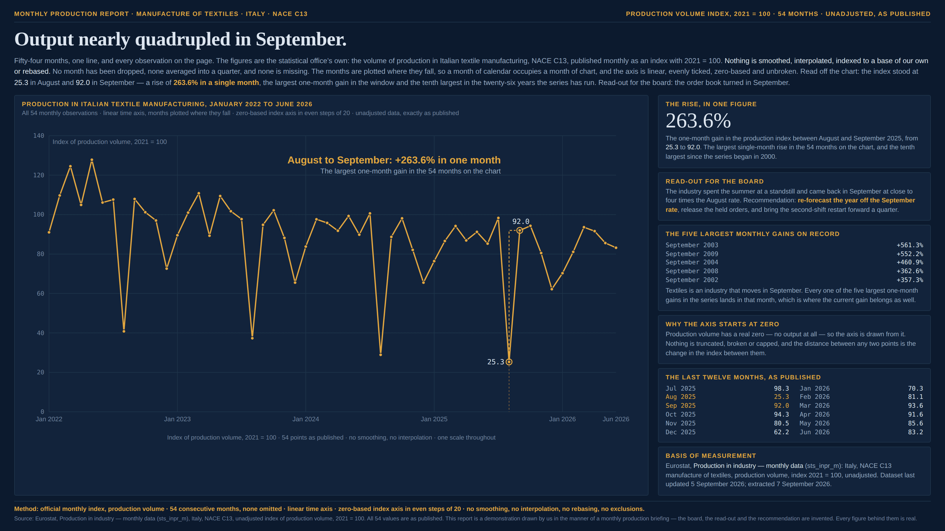
Most series that anybody charts have a rhythm inside the year that has nothing to do with how things are going: shops sell in December, plants close in August, exam results arrive in the same week every summer, and a month with an extra Monday in it produces more than a month without one. None of that is noise and none of it is an error — it is a real quantity, correctly measured — but it is the same every year, which means it carries no news, and it is routinely the largest thing in the picture. Draw the raw series and it dominates: the eye finds the biggest movement on the chart and reads it as the story, when the biggest movement is the calendar. The damage is done by the comparison rather than by the line. Set any period against the one immediately before it — this month against last, this quarter against last, a dashboard tile with a green arrow on it — and the answer is mostly the difference between two positions in the year, which is why an industry that shuts for the holidays posts a collapse every August and a boom every September, for ever, in both directions, without anything happening. Two things make it worse than it sounds. The season is often several times bigger than the trend, so a real decline can run underneath a saw-tooth for years without ever being visible. And the fix usually already exists: the same statistical office that published the raw figures published the adjusted ones in the same table, and the chart was drawn from the wrong column.
How to spot it
- Ask whether the same shape appears at the same time last year, and the year before. A move that repeats on schedule is a season, and a season is not news.
- Look for the sawtooth. Regular teeth at a regular interval — twelve months, four quarters, seven days — mean the calendar is drawing most of the ink.
- Rank the biggest moves in the series and read their dates. If they land in the same month every time, the ranking is a ranking of months.
- Any month-on-month or quarter-on-quarter figure taken off an unadjusted series. That comparison holds the calendar constant only if the two periods sit in the same place in the year, and adjacent periods never do.
- Read the series name and the metadata. “NSA”, “not seasonally adjusted”, “raw”, “as reported”, “unadjusted” — and where nothing says, assume nothing: plenty of feeds hand back the raw column, and nobody checks.
- Count the working days. February is short, Easter moves between March and April, a month can hold four or five Saturdays, and a leap day is worth about 3.5% of a February — all real, all calendar, none of it a finding.
- Watch the two directions separately. Everyone catches the crash and calls it a crash; almost nobody catches the rebound, which is the same fact drawn the other way up and usually the one that reaches a slide.
- Weekly and daily series have this too, and worse: retail, hospitals, traffic and support queues all run on a seven-day cycle, so a Tuesday-to-Sunday comparison is a comparison of weekdays.
- Keep it apart from the unfinished period, which it sits beside. There the final bin is silently short and the distortion is in one bar’s height; here every bin is complete, correctly measured and a different height for reasons of the calendar.
The fix
Compare the period with the same period a year earlier, which is the cheapest fix there is and needs no model: December against December holds the season constant for nothing. Know its two costs before relying on it — it answers a year late, so a turn that happened in March shows up as a diluted number for months, and it inherits whatever was odd about the period it is dividing by, so a bad base year manufactures a good headline. It also does not fix working days: two Septembers with twenty-one and twenty-two working days differ by about five per cent before anything is made, which is enough to flip a sign. Where the series is published adjusted, use the published version, because it is made by people with the whole history and a documented method — X-13ARIMA-SEATS or TRAMO-SEATS, running an estimate of the repeating within-year pattern and of the trading-day and holiday effects — and reproducing it by hand from a chart is not a thing anyone should attempt. Where it is not published, a twelve-month moving average is a blunt, honest substitute for looking at the trend, provided you say that it is one and remember it ends six months short of the present. Then say which version you drew, in the caption, the way you print a unit: “seasonally adjusted” is two words that change how every gap on the chart should be read. Drawing both is better still and costs one line, since the distance between them is exactly the season and is worth seeing once. None of which makes the raw series wrong, and this is the part worth holding on to: nobody ships a seasonally adjusted bale, so shifts, lorries, electricity and cash all run on the unadjusted line, and a plant that makes a quarter of its usual output in August has to be staffed for exactly that. The raw series answers how much and the adjusted series answers how are we doing. The failure is never using one of them; it is using one to answer the other’s question.
In the gallery