All techniques
Size & scale
The treemap
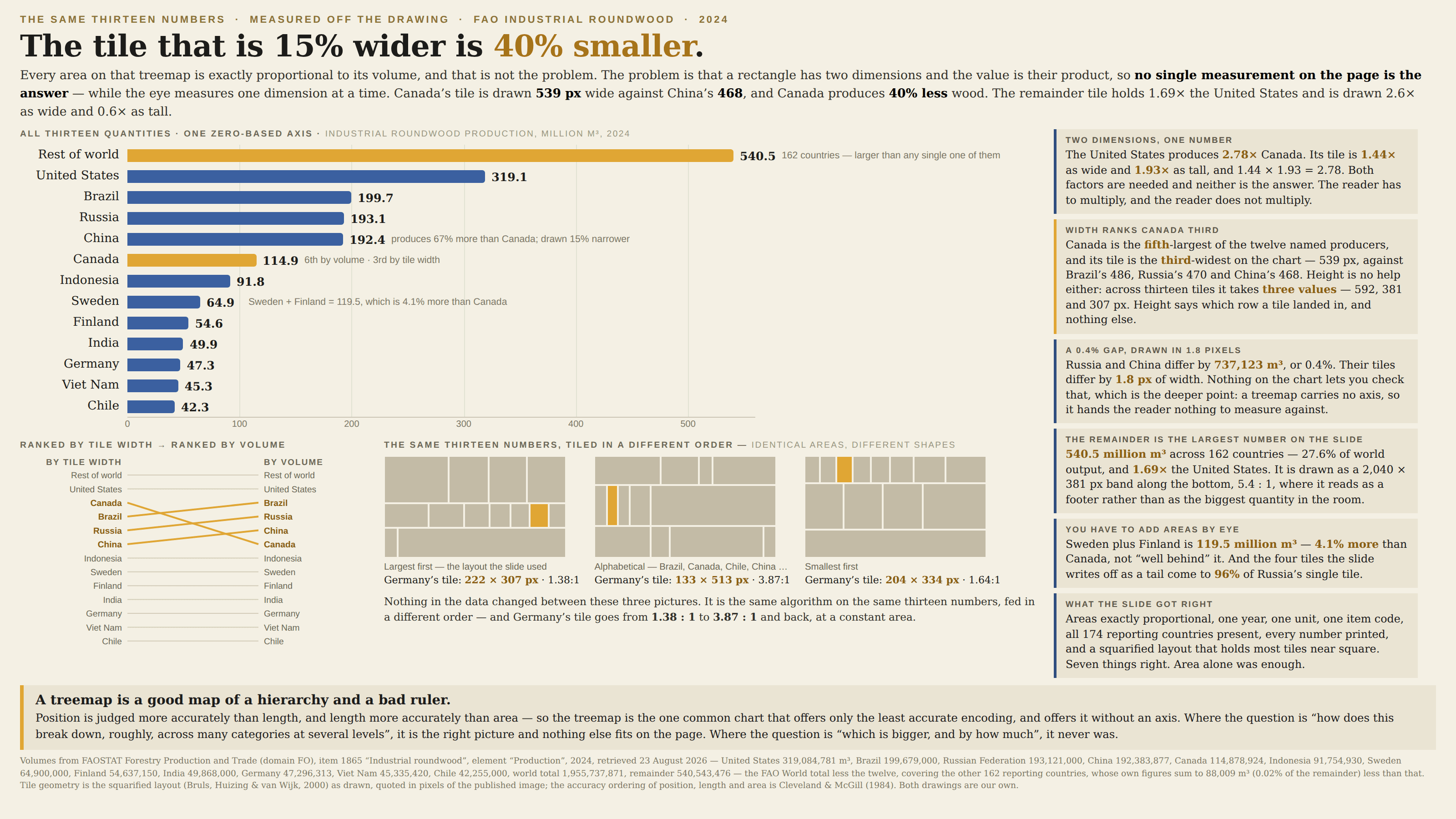
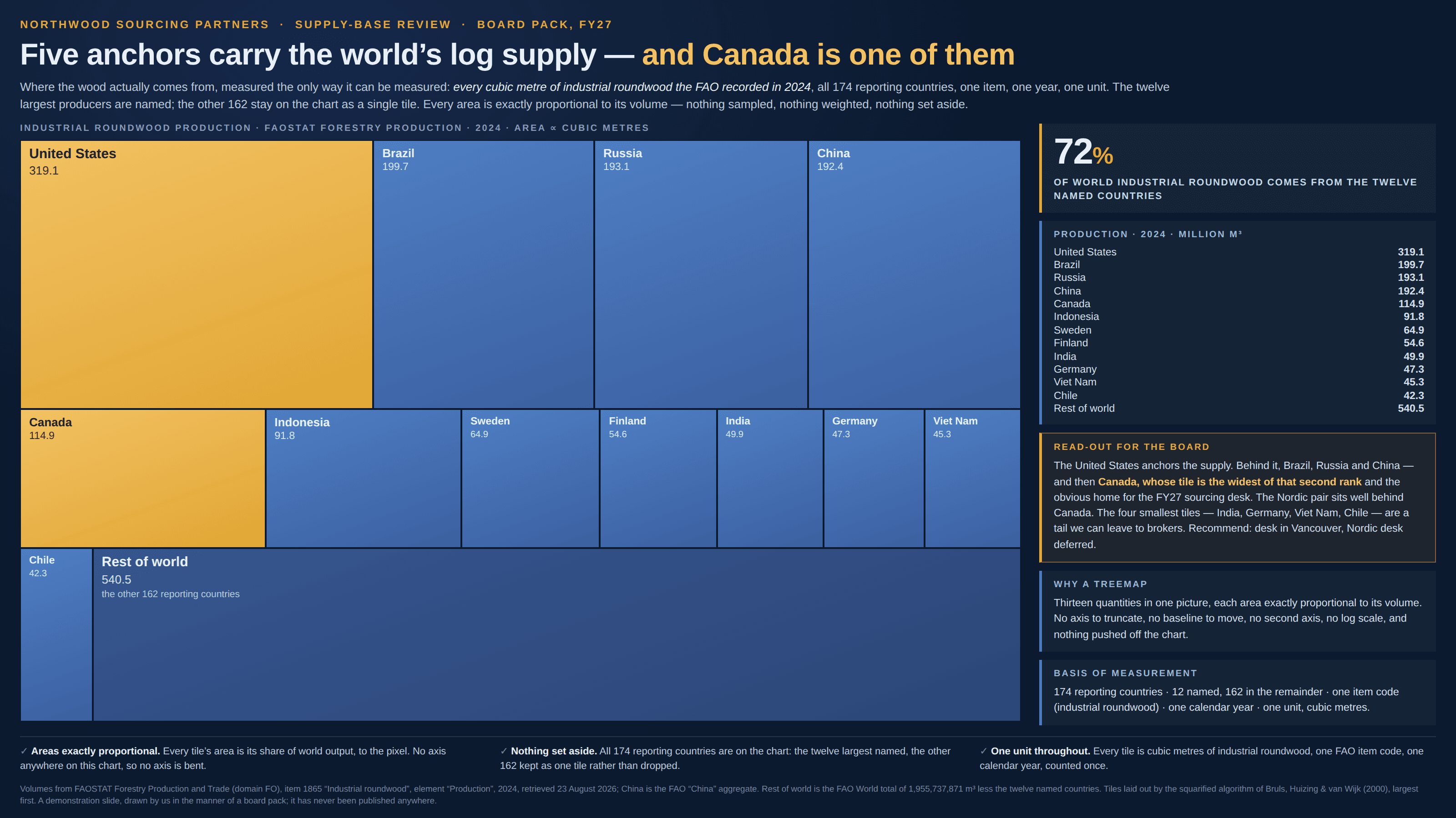
Thirteen rectangles, no axis, and one area judgement per comparison.
a.k.a. tile chart · squarified treemap · nested rectangles · the box-in-a-box chart · mosaic plot · marimekko chart
A treemap gives every value a rectangle whose area is exactly proportional to it, and then packs the rectangles together. The arithmetic is impeccable and the job it hands the reader is the hardest one on any chart: area is the product of two dimensions, so nothing you can measure on the page is the value. A tile can be the widest on the chart and the fifth largest, because width is only half of it. There is also nothing to measure against — no axis, no baseline, no gridlines, only neighbours — and the shapes are not even fixed by the data: feed the same numbers to the same layout in a different order and every rectangle changes proportions while its area stays put.
How to spot it
- Pick two tiles and try to say which is bigger and by how much. If you catch yourself comparing widths, you have answered a different question than the one you asked.
- Look for a wide, short tile beside a narrow, tall one. Equal areas in those two shapes never look equal, and unequal ones routinely look the wrong way round.
- Find the axis. There isn’t one — so every number you take off a treemap, you have actually taken off a label.
- Ask what order the tiles were fed in. Squarified, ordered, strip and slice-and-dice layouts draw the same data as four different pictures.
- Watch the “other” tile. A remainder is often the largest single value on the chart, and it usually gets drawn as a long band along one edge, where it reads as a margin rather than as a quantity.
- Count the levels. A treemap is a hierarchy chart; where the data has only one level, the nesting is doing nothing and the area is doing everything.
- Tiles too small to carry a label. Anything under about 1% arrives as a sliver, which is what a long tail looks like when it has no axis to lie along.
The fix
If the question is which is bigger and by how much, put the values on one zero-based axis and sort them: a bar chart trades area for length, and length is judged far more accurately than area — which is the whole of the improvement. It costs vertical space and buys a ranking the reader can actually read, plus room to print the numbers, plus the ability to see a remainder for what it is instead of as a band along the bottom. Where the interesting comparison is between a group and a single item, draw the group’s total as its own bar rather than asking anyone to add areas by eye. Keep the treemap for the job it is genuinely good at, which is real and worth having: a hierarchy with several levels and more categories than a bar chart can hold, read for shape and for share-of-whole rather than for rank — a disk-usage map, a budget broken down four levels deep, a portfolio by sector and holding. When you do use one, sort the tiles so position carries some information, label every tile with its number, keep the layout near square and say which layout it is, and lift any comparison that actually matters out of the picture and into a small sorted chart beside it.
In the gallery