All techniques
Framing & context
The unfinished period
The last bar is short because the period is young, not because anything changed.
a.k.a. the partial period · year-to-date drawn as a year · the incomplete final bin · the ragged edge · reporting lag · provisional data · the last-bar drop · the data-lag cliff
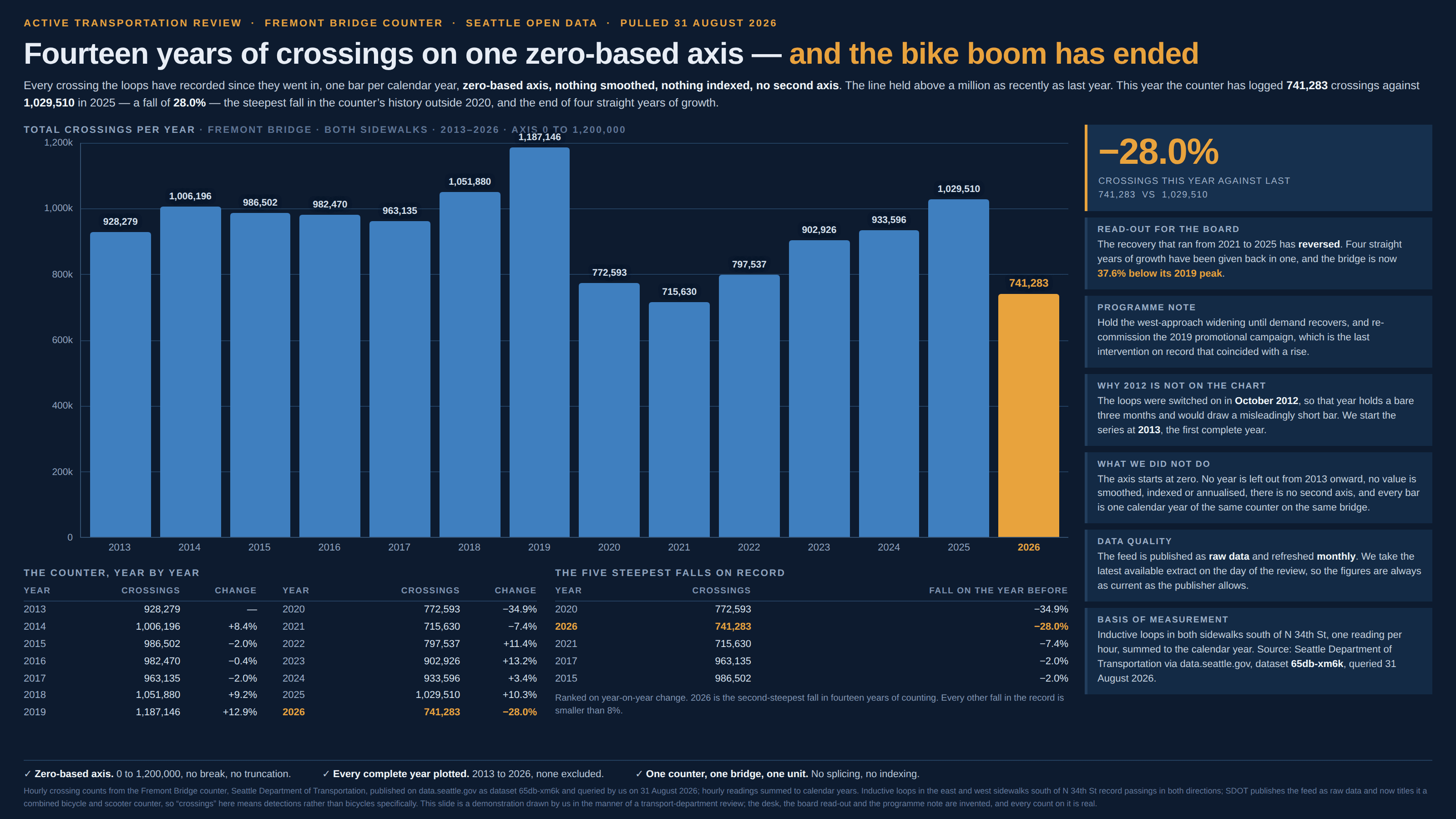
A chart of periods makes a promise so quiet nobody hears it: that each bar is one period, and that the periods are the same length. The last one usually is not. A year drawn at the end of August holds seven months, a month drawn on the third holds two days, and where the figures arrive late even a period that has closed on the calendar is still filling in for weeks afterwards. The bar is drawn at full width regardless, because the width comes from the axis while the height comes from whatever had been counted at the moment somebody pressed download — so the shortfall is a fact about the download date rather than about the world, and it lands in the one position on the chart a reader trusts most, the end, where the story is supposed to be. It is the chart crime with an expiry date. Leave it a few months and it repairs itself, which is exactly why nobody ever goes back to the slide that was already presented. Keep it apart from uneven intervals, which it sits next to: there the unequal bins are known, declared and merely spaced wrongly along the x-axis, so the distortion is in the slope; here the last bin is silently short, nobody has declared anything, and the distortion is in the height.
How to spot it
- Look at the last bar, then find the date the data was pulled. If the period that bar names had not finished by then, it is not a period — it is however much of one had elapsed, drawn at the width of a whole one.
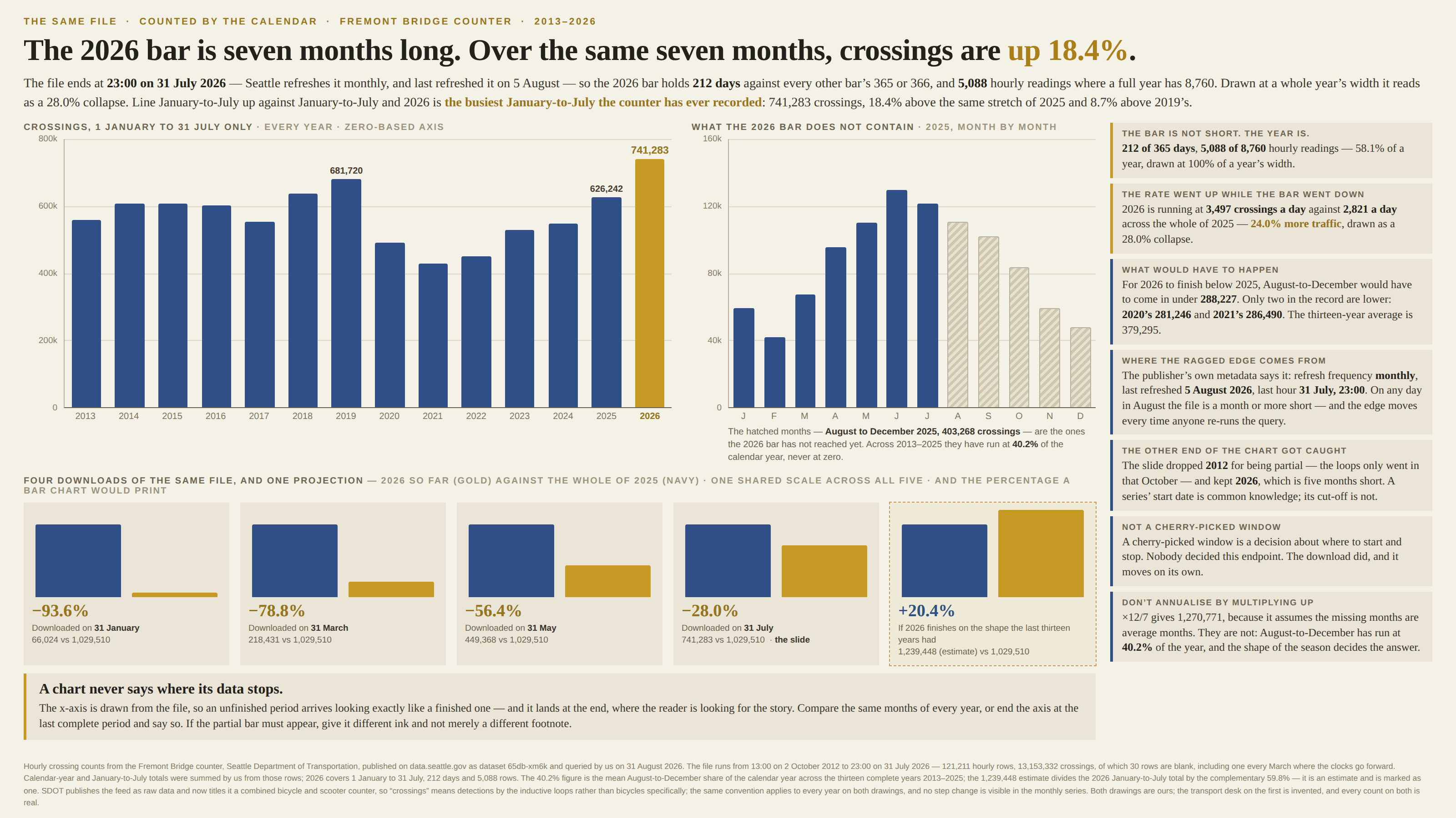
- Count the rows behind the final bin the way you would count them behind any other. A year of hourly readings is 8,760 of them; 5,088 is seven months wearing a year’s label.
- Check the size of the drop against the size of the gap. A year cut at the end of July is missing months worth roughly 40% of a normal one, so a “collapse” of about that much is the calendar, not the phenomenon.
- Notice that the other end of the chart is fine. A partial first period gets spotted and dropped, because everyone knows when a series began; a partial last one gets plotted, because nobody thinks to ask when it stops.
- Read the publisher’s own metadata for the refresh frequency and the date of the last update. A feed refreshed monthly is always a month or more short at its edge, and that edge moves every time anyone re-runs the query.
- The words “year to date”, “provisional”, “preliminary” or “partial”, or a footnote naming a cut-off — then check whether the chart above them draws that period any differently from the rest. Usually the caveat is in the text and never in the ink.
- A dashboard tile comparing “this month” with “last month”. On the first of the month it reads as a catastrophe and on the thirty-first as a recovery, with nothing having happened in between.
The fix
Compare like with like, which here means the same slice of the calendar in every period: January to July this year against January to July in each of the years before it. That is a complete chart of a real quantity rather than a maimed chart of a bigger one, it needs no caveat, and it very often reverses the finding outright. The alternative is to end the axis at the last complete period and say so in the caption — a chart that stops where the data stops is never wrong about where the data stops. If the unfinished period must appear, give it different ink and not merely a different footnote: hatch it, lighten it, break its outline, label it with the span it actually covers, and print the cut-off date on the axis where the reader is already looking. Resist annualising by multiplying up, because that assumes the missing months are average months and they are not: most series that anyone charts have a season, and the months still to come are usually the ones the season chose. If you must project, project on the shape the earlier years actually had, and mark the result as an estimate rather than an observation. The most useful sentence you can add is the one that states the test in reverse — what the rest of the period would have to do for the apparent decline to be real — since the answer is frequently a number no period in the record has ever hit. And keep the two versions of this apart, because they want different remedies. Calendar-incomplete is solved by looking at a calendar; reporting lag bites periods that have already ended, and is solved by plotting only the periods old enough to have settled and saying in the caption how old that is. On a dashboard, where the edge moves every morning, fix the window instead of the endpoint: a trailing twelve months, or this period against the same period last year, both of which stay honest without anybody remembering to re-check them.
In the gallery