All techniques
Framing & context
The heaped digit
The spike is where the pen stopped, not where the world piled up.
a.k.a. digit preference · terminal digit preference · end-digit bias · age heaping · the rounding artefact · Whipple’s index · recording granularity · the measurement lattice
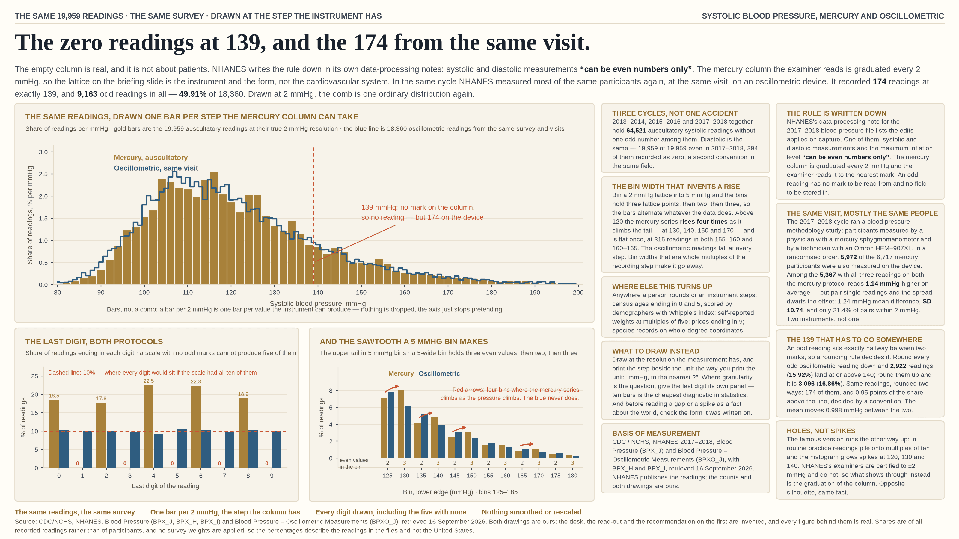
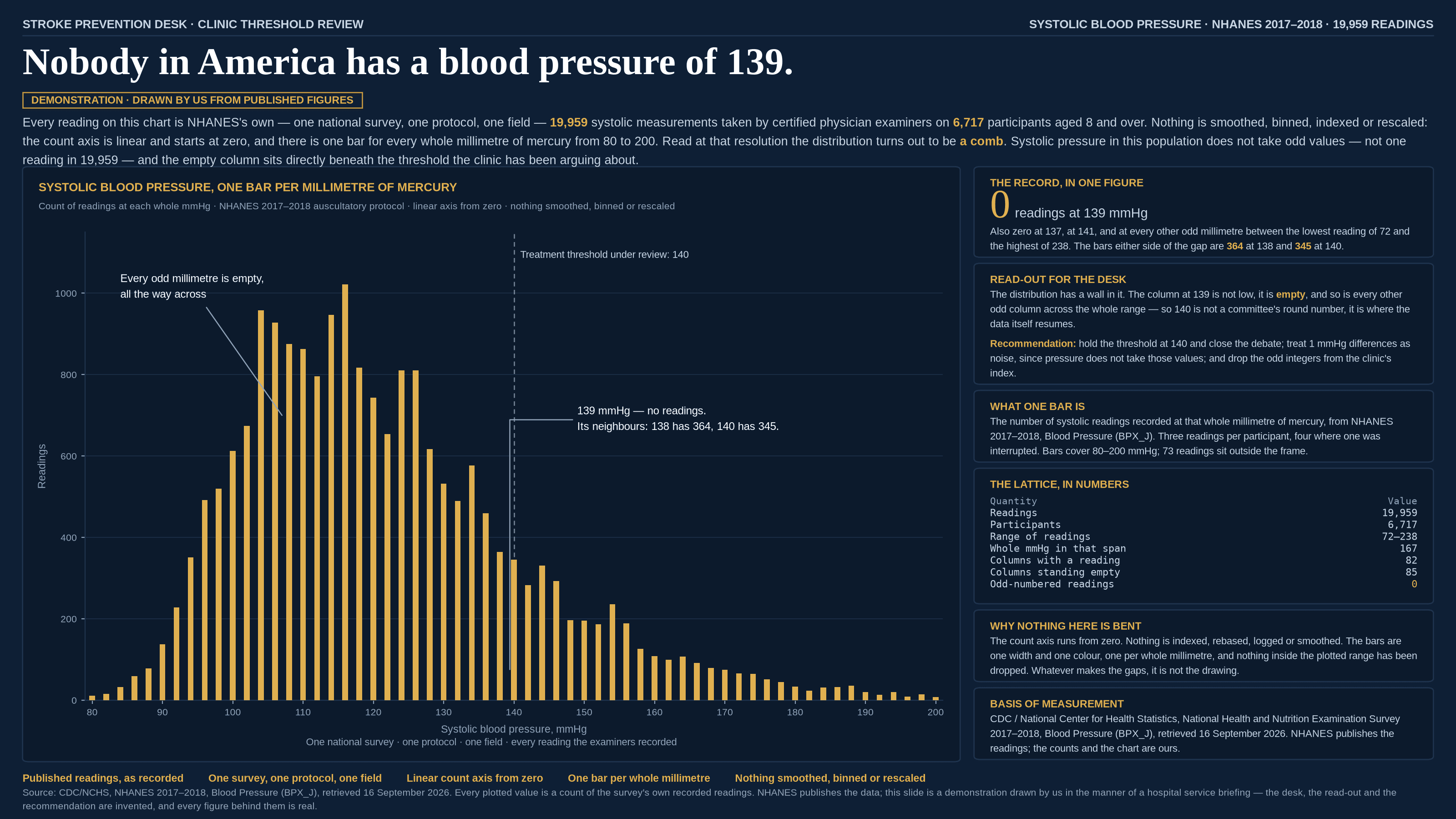
Every number on a chart was written down by something — a person reading a dial, a form with a field on it, an instrument that steps. None of those can express every value, and the ones they favour are not the ones the world favours. Draw the distribution fine enough and what appears is the recording scale rather than the quantity: spikes where a human rounded to a comfortable number, and holes at the values the instrument or the form had no way to record. It is the near neighbour of the count that measures the looking and not the same thing — nothing here is undetected, nothing is missing, and every row in the file is drawn. The values are simply snapped to a lattice somebody chose, and a histogram is fine-grained enough to show you the lattice.
How to spot it
- Look at the last digit. Ten bars, one per final digit, is the cheapest diagnostic in statistics: a clean scale gives roughly a tenth each, and anything else is the recording habit talking.
- Watch for spikes at the round numbers — multiples of five, ten, twenty-five, a hundred — especially in anything self-reported, estimated by eye, or read off an analogue scale.
- Watch for the opposite too. A comb of empty columns means a scale with fewer steps than your axis has ticks, and the gaps are as much an artefact as the spikes.
- Ask what the measurement was recorded to the nearest of, and whether that is coarser than the difference the chart is asking you to see. A 1-unit finding on a 5-unit scale is not a finding.
- Check the thresholds. A cut-point that lands on or just beside a favoured value is decided partly by the rounding rule, because everything within half a step of it moves across on somebody’s convention.
- Suspect the bin width whenever it is not a whole multiple of the recording step: 5-wide bins over a 2-step lattice hold three values, then two, then three, and the bars alternate whatever the data does.
- Read the publisher’s own notes. Data dictionaries, edit rules and interviewer manuals usually state the granularity outright, right next to the field.
The fix
Draw at the resolution the measurement actually has. One bar per step the instrument can take turns a comb back into a distribution, and the picture stops asserting a precision nobody recorded. Then print the granularity beside the unit the way you print the unit — "mmHg, to the nearest 2", "years, as reported" — because it is part of what the number means and it costs four words. Where the granularity is itself the question, give the last digit its own panel; ten bars beside the main chart settle in one glance what a paragraph of caveats cannot. Choose bin widths that are whole multiples of the recording step, so the bins hold equal numbers of reachable values and the sawtooth never appears. Where a second, finer measurement of the same thing exists — a scale beside the self-report, an automatic instrument beside the manual one — draw both, because the disagreement is the most honest error bar you will get. And before reading a spike or a gap as a fact about the world, check the form it was written on: a distribution is a statement about the recording system first and the population second.
In the gallery