All techniques
Size & scale
The overplotted scatter
A thousand records in one dot, and one record in one dot.
a.k.a. overplotting · overdraw · the saturated scatter · the blob · tied points · exact ties · the hairball · opaque markers · alpha = 1 · the big-data scatter
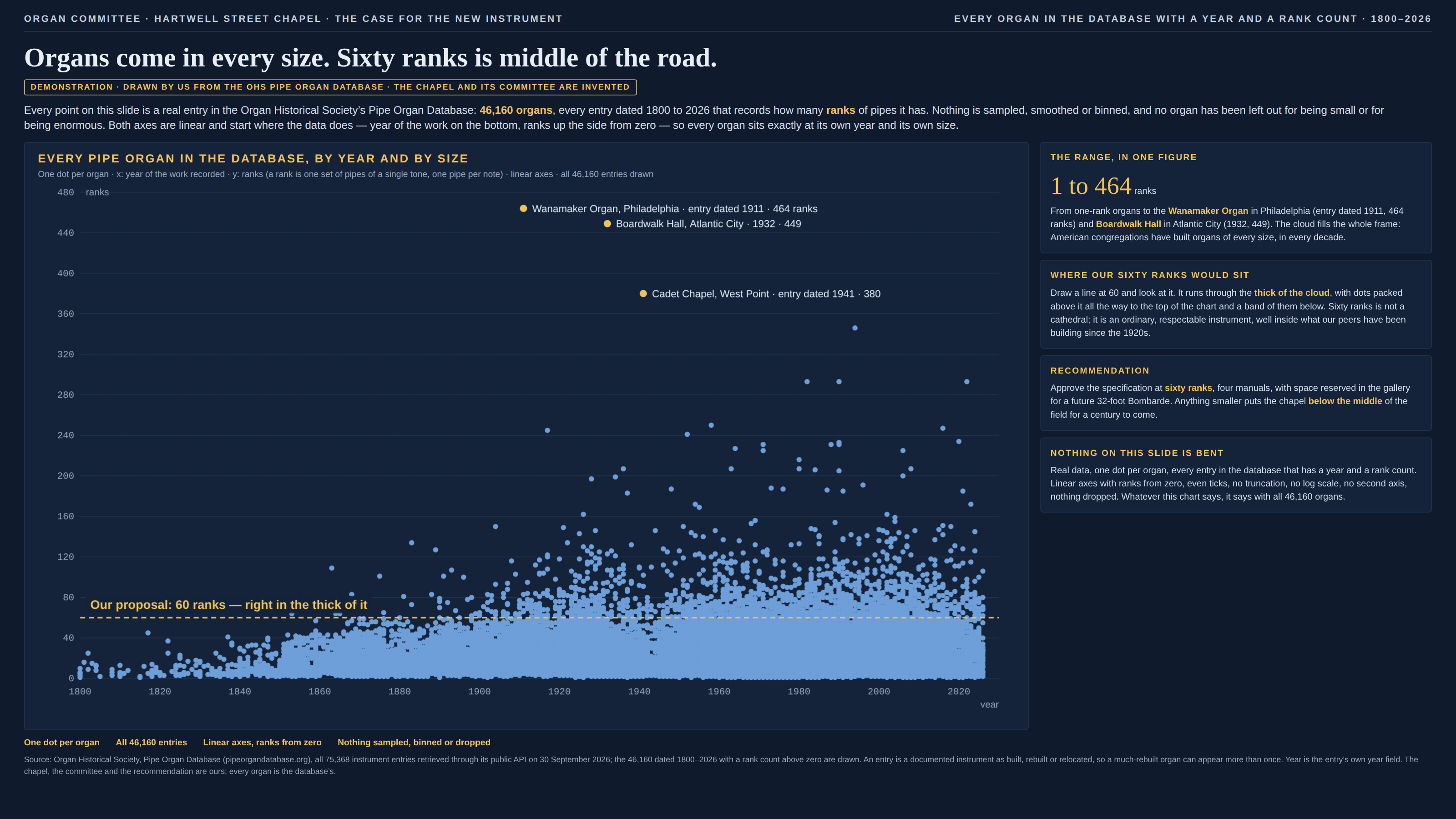
A scatter plot makes one quiet promise: one mark per record, so more records means more ink. The promise holds right up to the moment two records land in the same place, and after that it breaks without any sign on the page. A second opaque dot on a spot adds nothing, and neither does the thousandth. Where the data is dense, the dots fuse into a solid shape whose size is set by how far the crowd spreads rather than by how many are in it; where the data is sparse, every lonely record gets a whole dot of its own. So a few hundred stragglers scattered across an empty field can cover more of the page than tens of thousands of records packed into one corner, and the eye, which reads covered area as quantity, takes the stragglers for the story. What the chart has really drawn is the range of the data, and it looks exactly like a picture of the distribution. Rounded and whole-number data make it far worse, because then records do not nearly overlap, they tie exactly: when both axes are counts, years or ratings, a thousand identical records are one dot, drawn precisely as large as the single record next to it. Marker size does the rest: a dot wider than the gap between neighbouring values merges records that do not even tie, so the bigger the markers and the tighter the data, the sooner the crowd becomes a slab. Nothing in the audit catches it. The scales are linear and honest, no record has been dropped, every point sits exactly where it belongs, and the only thing missing is the one quantity a scatter plot is usually asked about, which is how many. It is the area illusion running backwards: there, ink grows faster than the value; here, it stops growing at all once a spot is full. And it is a close relative of the heaped digit, since every value people round to is a place where records pile up and vanish into one mark.
How to spot it
- Count the dots you can see and compare it with the n in the caption. If a chart says forty thousand records and you could count its marks in an afternoon, most of them are underneath the others.
- Solid shapes with hard edges. A region of uniform ink with no texture inside it is a region where the chart has run out of ways to say “more”, and the density inside it could be anything.
- Axes that only take whole numbers or rounded values — years, counts, ages, ratings, scores. Records on a grid tie exactly, and an exact tie is invisible no matter how small the markers are.
- The eye drawn to the edges. If what you remember from a scatter is its outliers and its outline, ask where the middle half of the records is; on an overplotted chart the picture usually cannot tell you.
- Markers bigger than the spacing of the data. If a dot is several units tall on an axis that moves in steps of one, neighbouring values merge into one shape whether or not they tie.
- Opaque markers by default. Most plotting libraries draw fully opaque points unless told otherwise, so a scatter of a big table that nobody configured is overplotted until proved otherwise.
- A claim about what is typical — “all sizes”, “all over the map”, “no pattern” — made from a scatter plot rather than from a count. The scatter shows what is possible; typical is a question for the histogram.
The fix
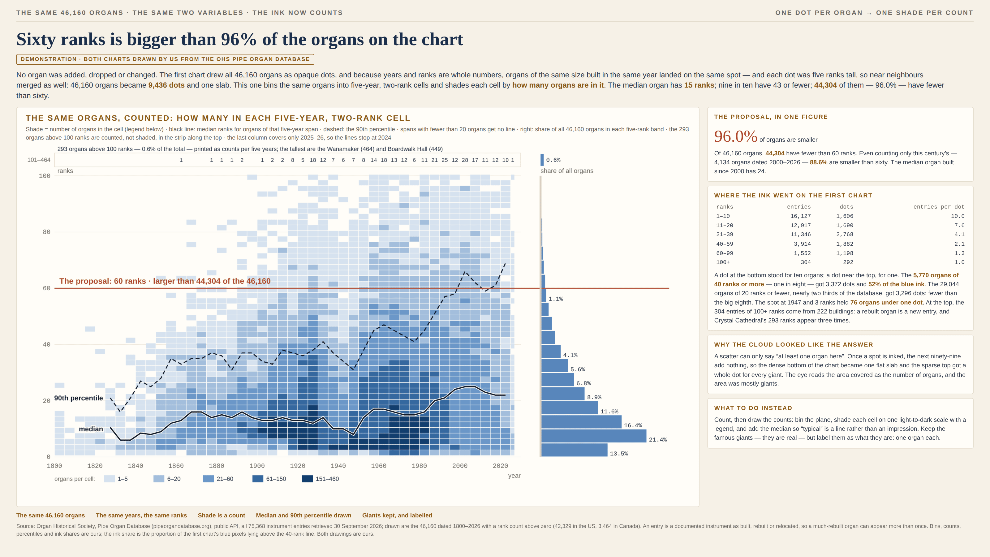
Give the ink back its job of counting. For a few thousand records, transparency is often enough: at low alpha, stacked points darken where they pile up, so density reappears as shade — though it saturates too, just later, so check the darkest spot is not already black. Where values tie exactly, jitter them by a fraction of the rounding step, and say that you did. For large tables, stop drawing records and draw counts: bin the plane into a grid or hexagons and shade each cell by how many records it holds, on a single-hue scale that runs from pale to dark with a printed legend, so the crowd is the darkest thing on the page and the stragglers are the palest. Then add the summaries a scatter never provides — a median line, a band holding the middle half or the middle nine-tenths, marginal histograms along the axes — because those answer the question about what is typical directly instead of leaving it to the eye. Keep the outliers visible if they matter, and label them by name, since that is honest about what they are: individual records, one each. And print the n in the places it lives. A caption that says how many records fall under the darkest region does more to correct the impression than any amount of redrawing.
In the gallery